Household Panel Study

Understanding Society

Explaining Household Panel Studies Clearly

Understanding Society is one of the UK’s largest household panel studies, tracking the same people over time to explore how lives and society change.

Essex University asked us to create an engaging explainer animation to help people understand what a household panel study is, how it works and why it matters. The animation needed to work across their website and social media platforms, making complex research accessible to the general public in a clear and compelling way.

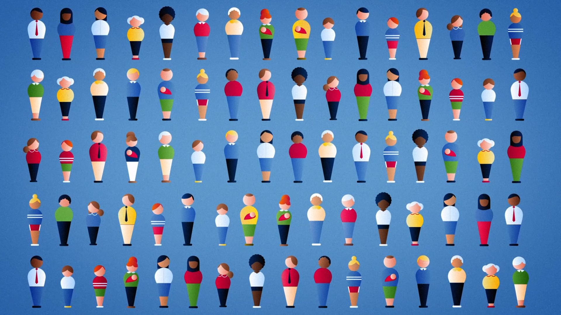
Illustration of a diverse grid of stylized people representing different ages, genders, and ethnicities, symbolizing a broad and inclusive population study or social research dataset.

Making Social Research Easy to Understand

We created a 2D explainer animation using clean illustrations and relatable characters to clearly explain how household panel studies work.

The goal was to simplify a complex process and highlight how long-term social research like Understanding Society benefits individuals and communities. The animation was designed to be short, accessible and engaging—perfect for use across websites and social platforms, helping Essex University reach wider audiences with a message that matters.

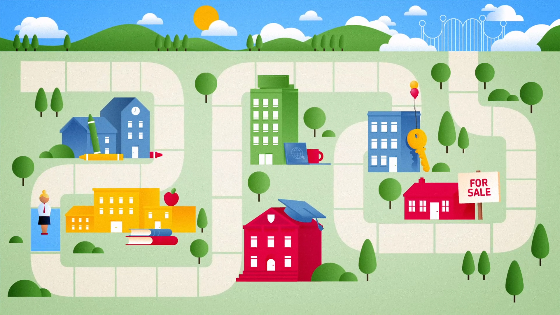
Colorful illustrated roadmap with schools, homes, and symbols of education and real estate, representing life paths, learning journeys, and housing choices in a community setting.
Illustration of a speech bubble containing four stylized people representing a family, including a baby, symbolizing communication, family life, and social research.
Illustration of a world map in a web browser window with flags marking various countries and a large yellow cursor pointing to East Asia, symbolizing global research or online data collection.
Illustration of diverse cartoon-style people, including a parent with a baby, being selected by a large hand, representing survey sampling or population studies in research.