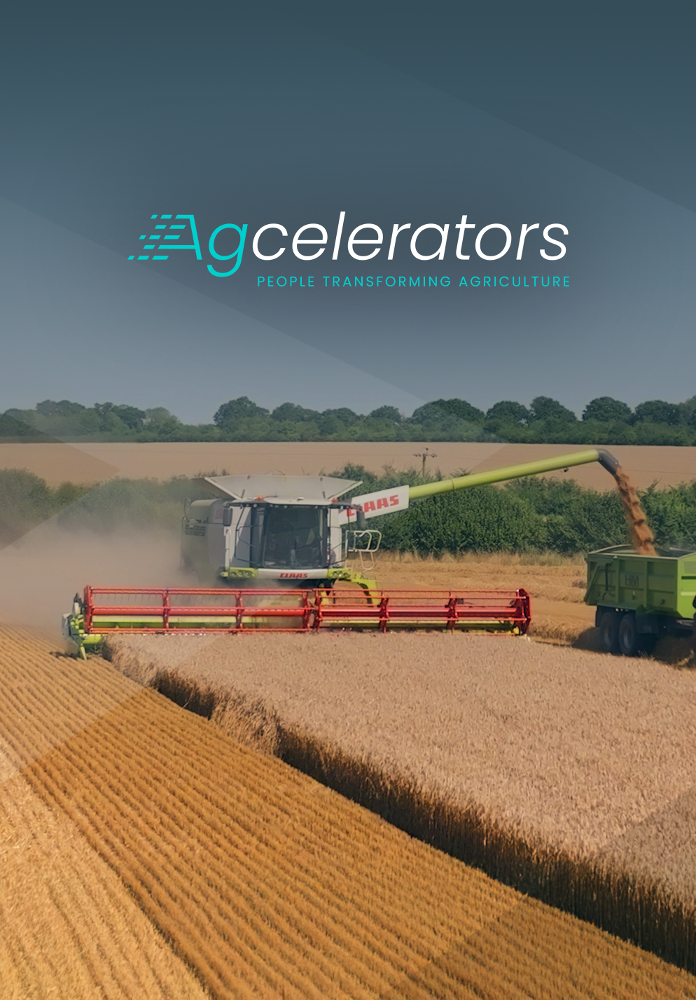
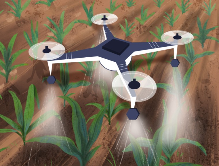
We created a global campaign with Syngenta to spotlight sustainable agriculture through real stories, empowering teams with brand identity, films, and tools to share their Agcelerator impact worldwide.
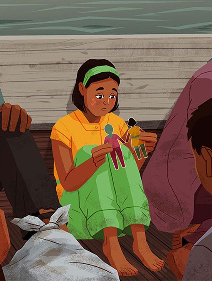
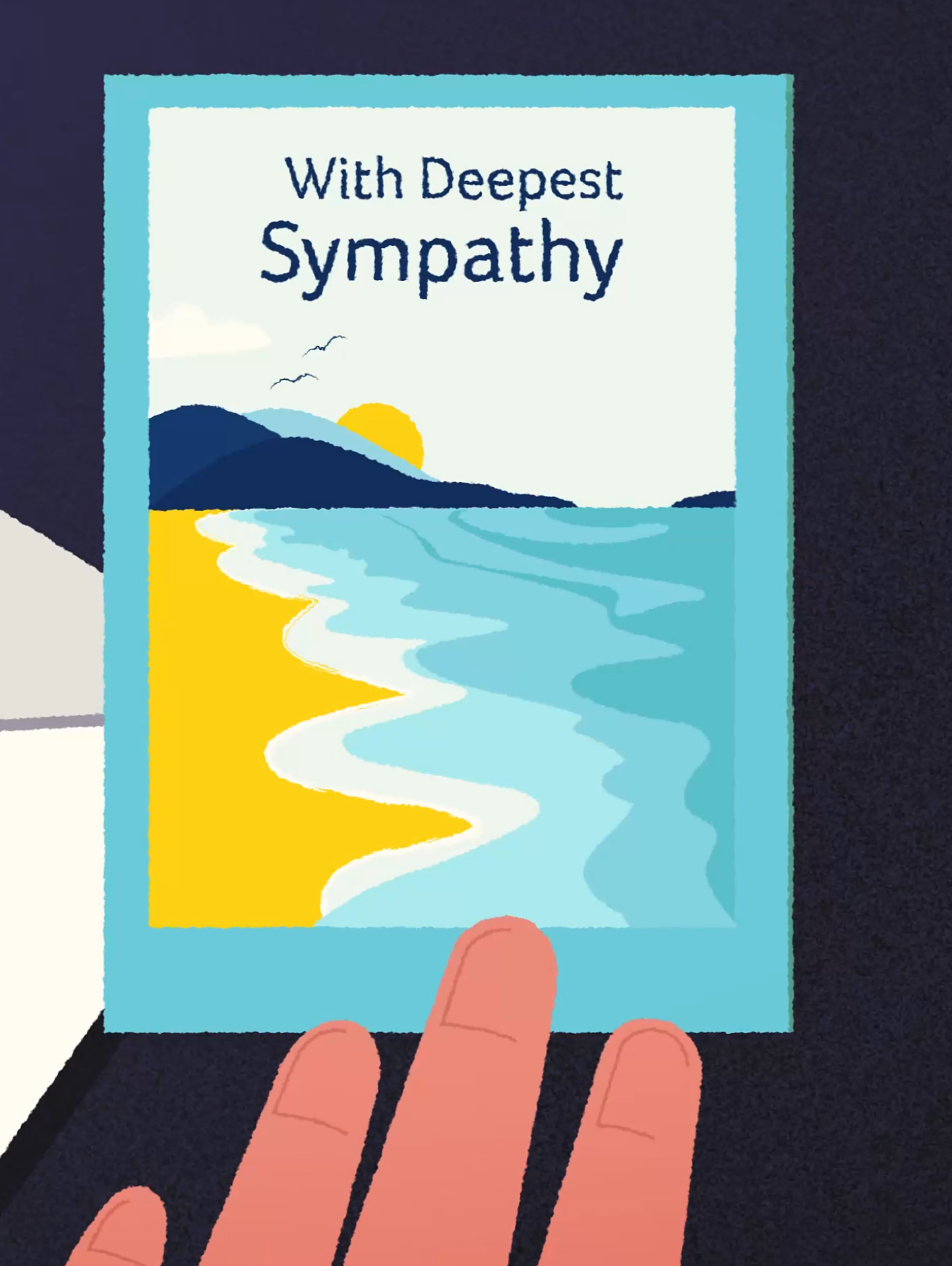
We created a moving 2D animation for Christian Aid, telling Sabika’s story to highlight the ongoing Rohingya refugee crisis and the urgent need to protect vulnerable women and children.
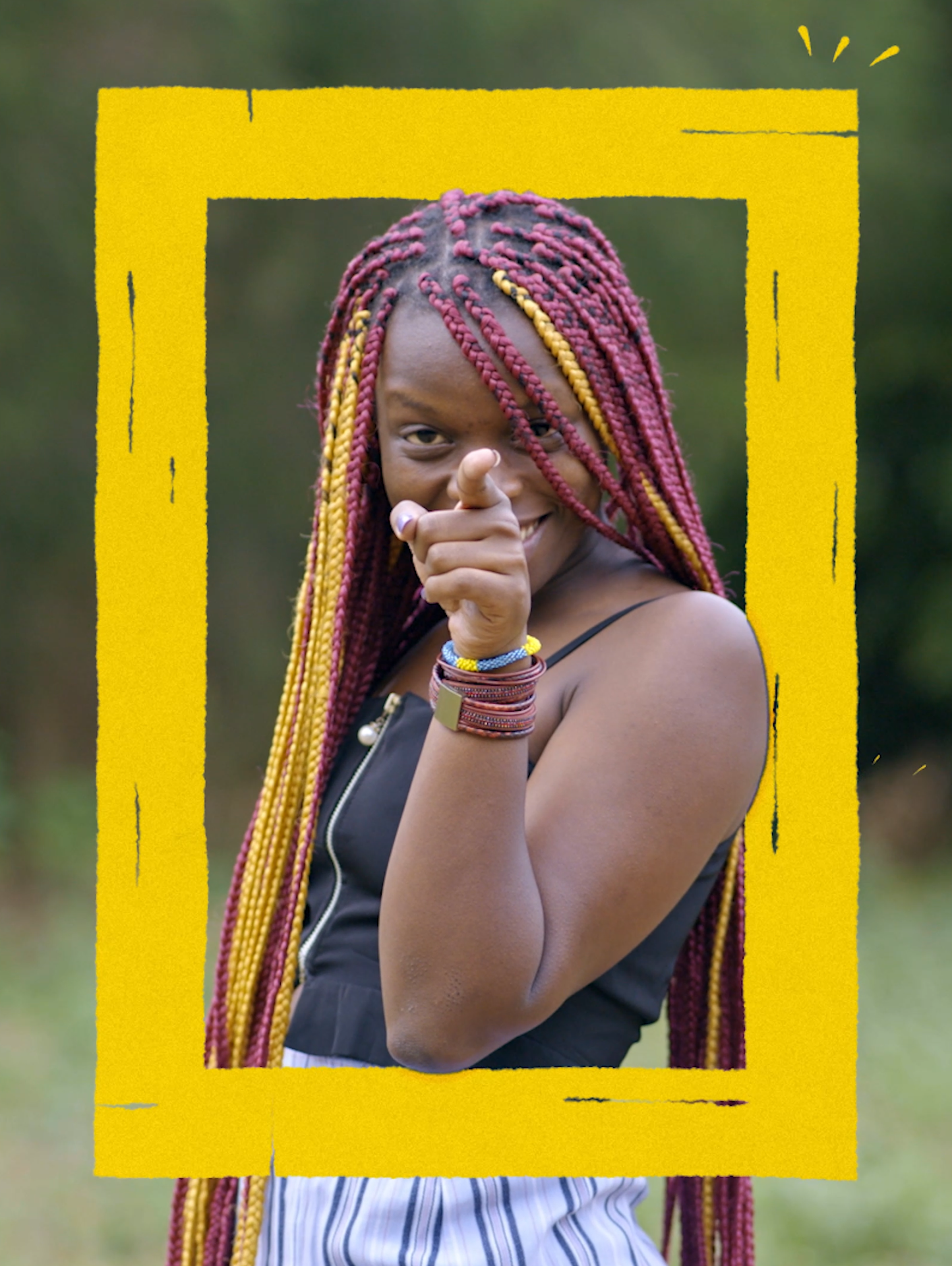
We combined live-action and frame-by-frame animation to bring eco-feminist Ineza’s story to life, using rotoscoped transitions and expressive illustration to highlight her voice, mission and message.
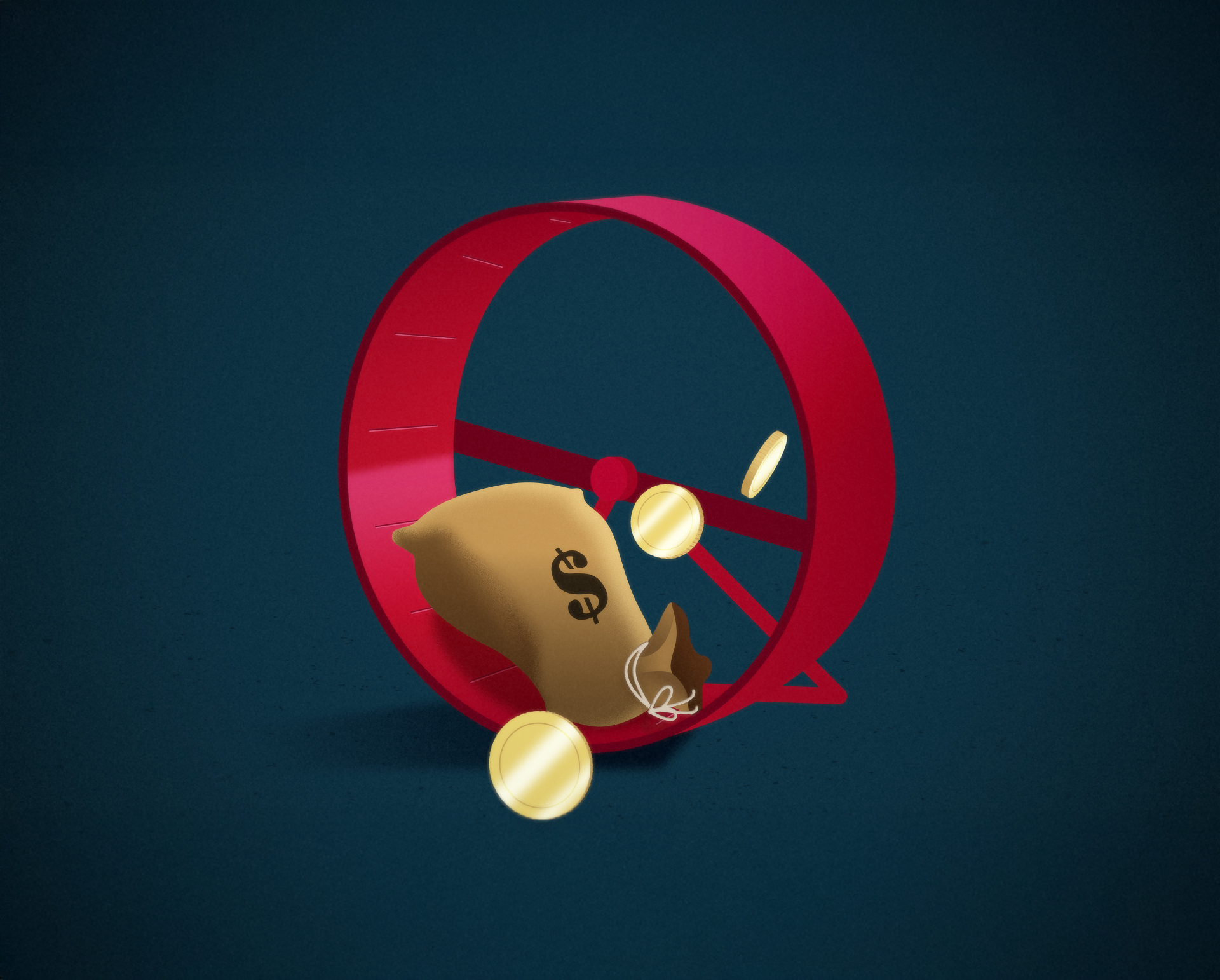
An editorial animation and illustration style that visualises the human impact of sovereign debt—turning complex policy and economic issues into clear, compelling storytelling for campaigns on rights, reform and resilience.
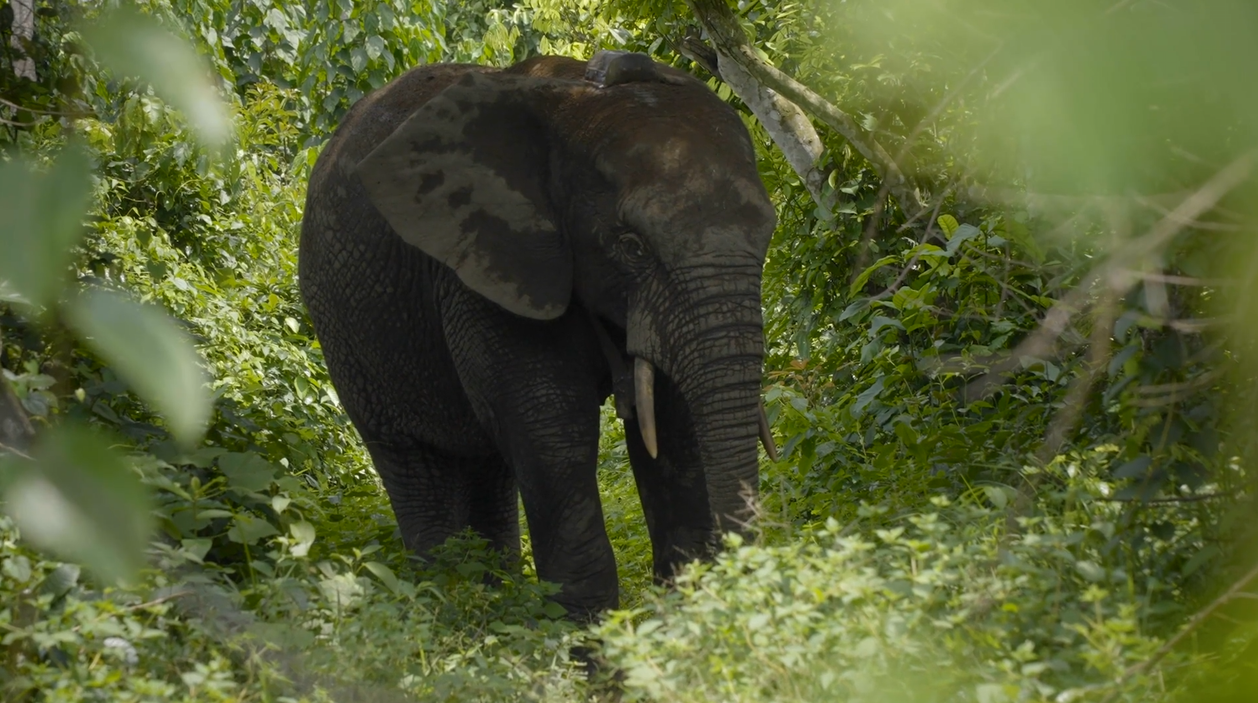
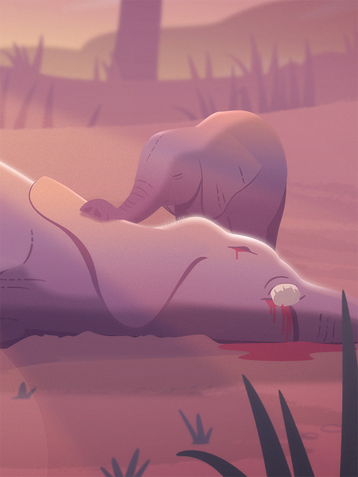
A cinematic film and animation for Fauna & Flora, highlighting innovative conservation work that is bringing research, people and elephants together in Guinea.
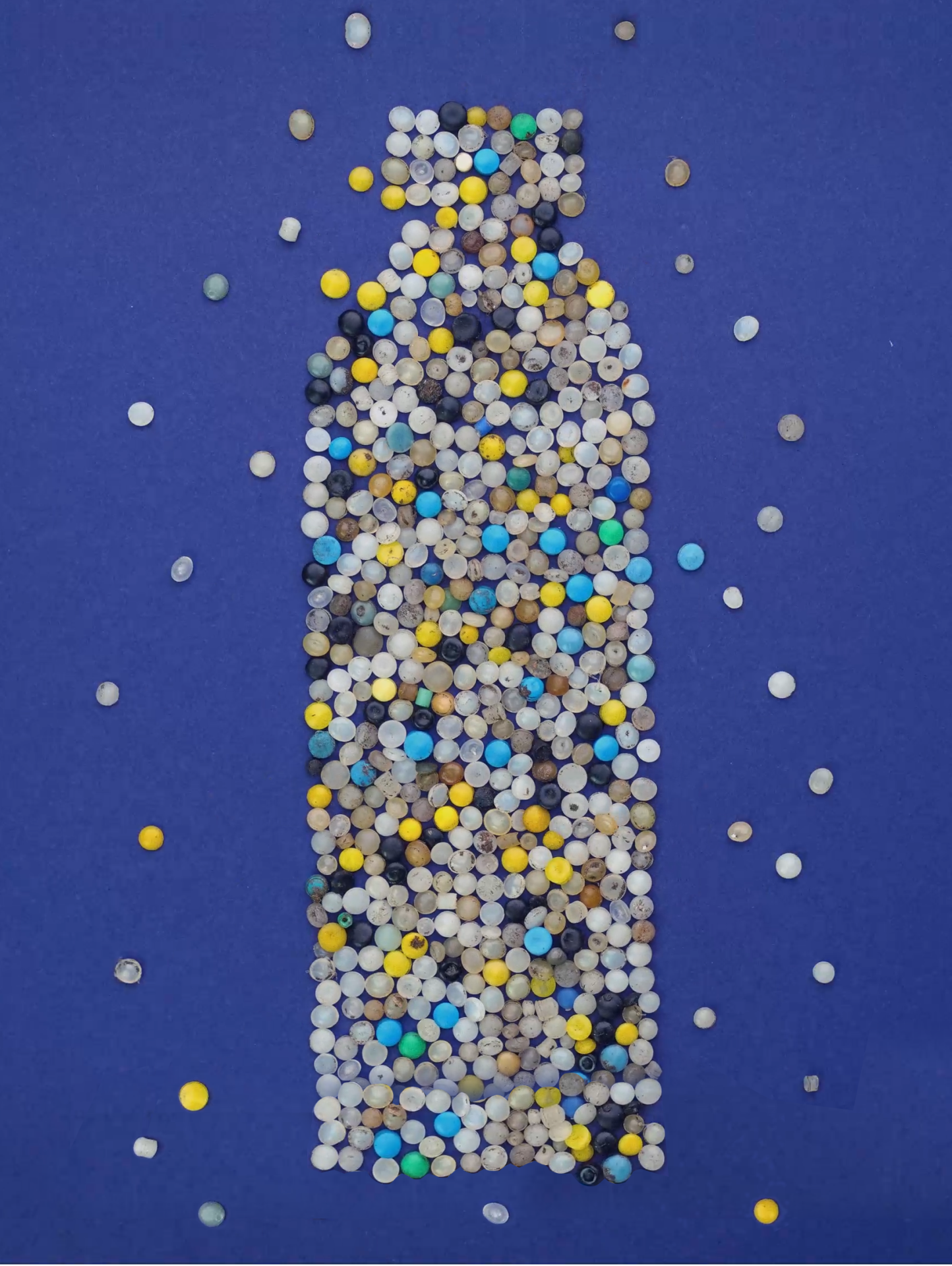
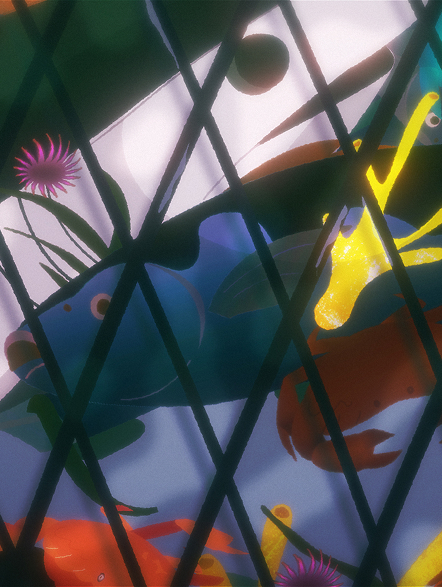
We created a mixed-media animation for Fauna & Flora International to raise awareness of nurdle pollution, combining stop-motion, 2D/3D animation, and real footage to highlight its devastating environmental impact.
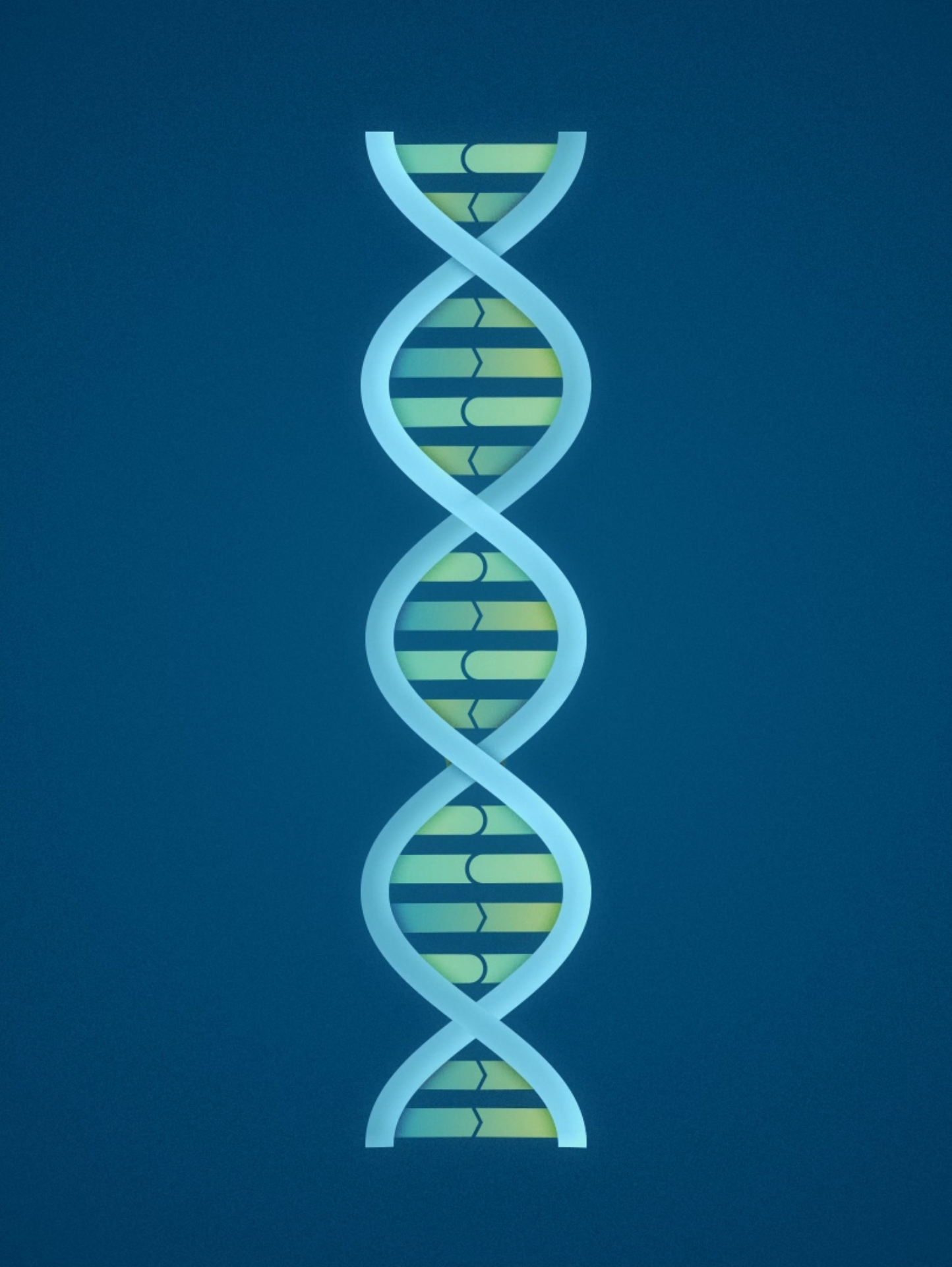
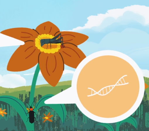
We created a minimal, logo-led 3D animation for Veiova to explain genetic sequencing and highlight its benefits, engaging an audience aligned with the brand’s vision for accessible, impactful science.
An animated retelling of the jade rabbit legend for The Macallan’s 200th anniversary and Mid-Autumn Festival campaign with Potlatch.
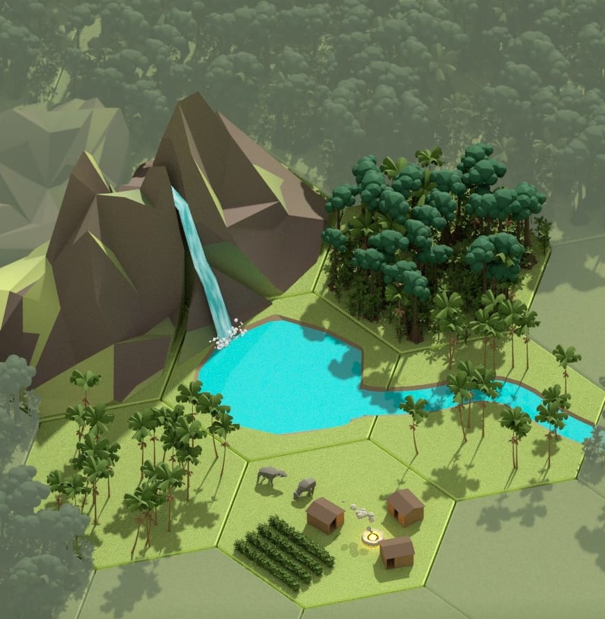
We created an immersive 3D animation for BirdLife that visualises the impact of decision-making on tropical forests, blending game-inspired environments, hand-drawn details and sound design to highlight sustainability and conservation.
We created a dynamic animation for EIA’s 40th anniversary, celebrating their impact on wildlife protection, deforestation, pollution, and climate action through four decades of investigative environmental work.
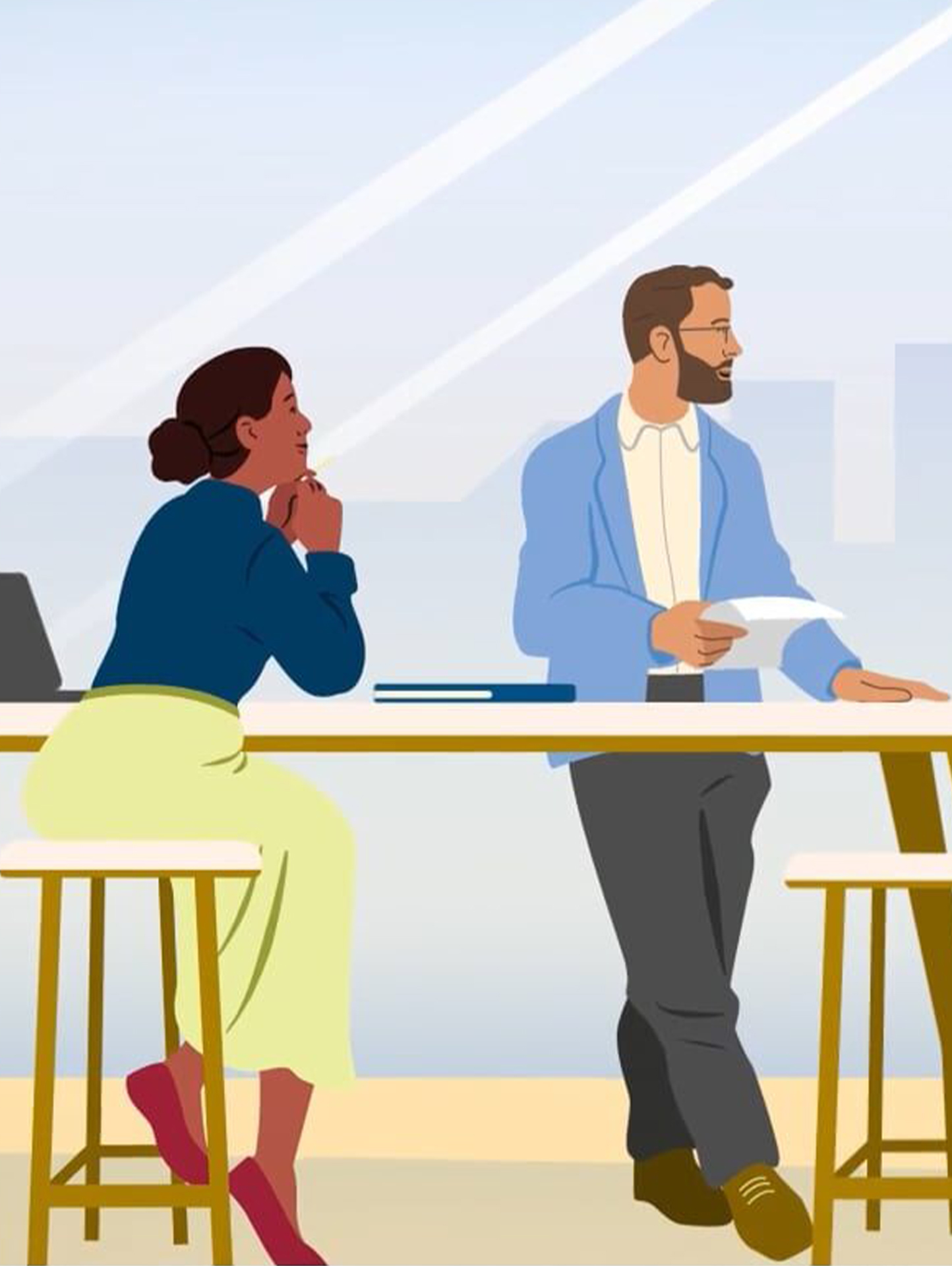
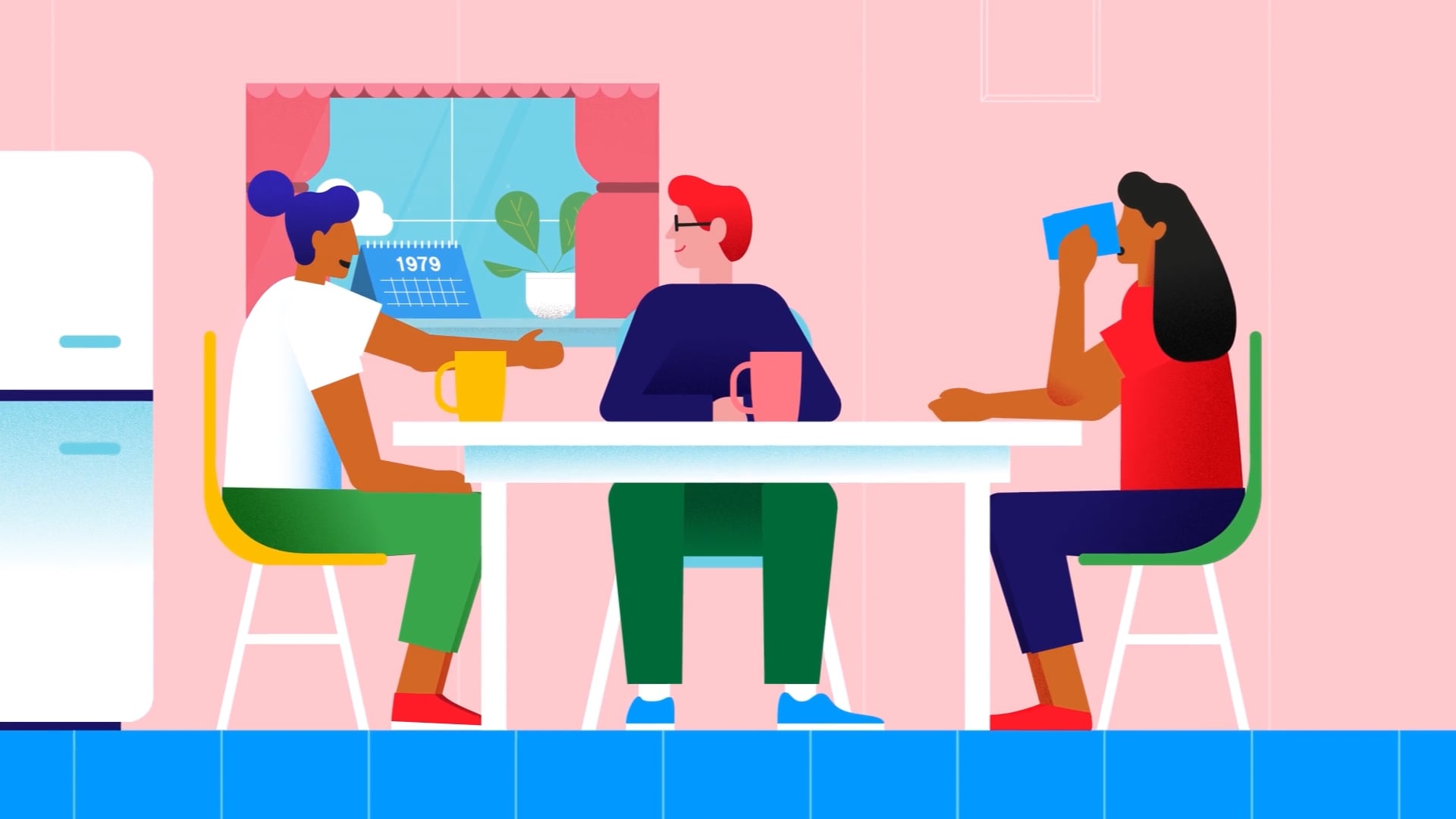
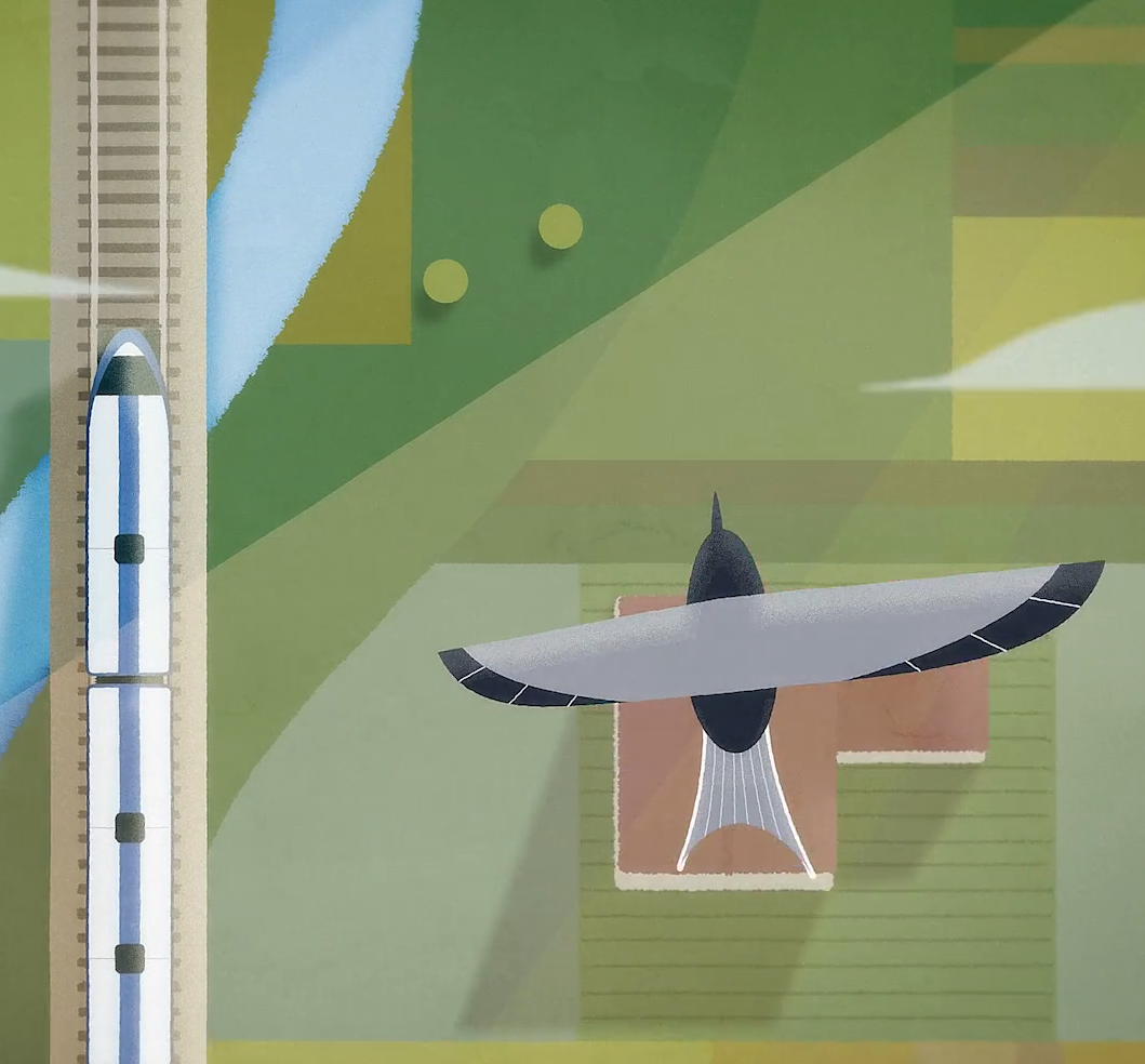
We created a series of animations for Railpen to explain their investment beliefs, using character-led storytelling and consistent visual design to build trust and connect members with the people behind the fund.
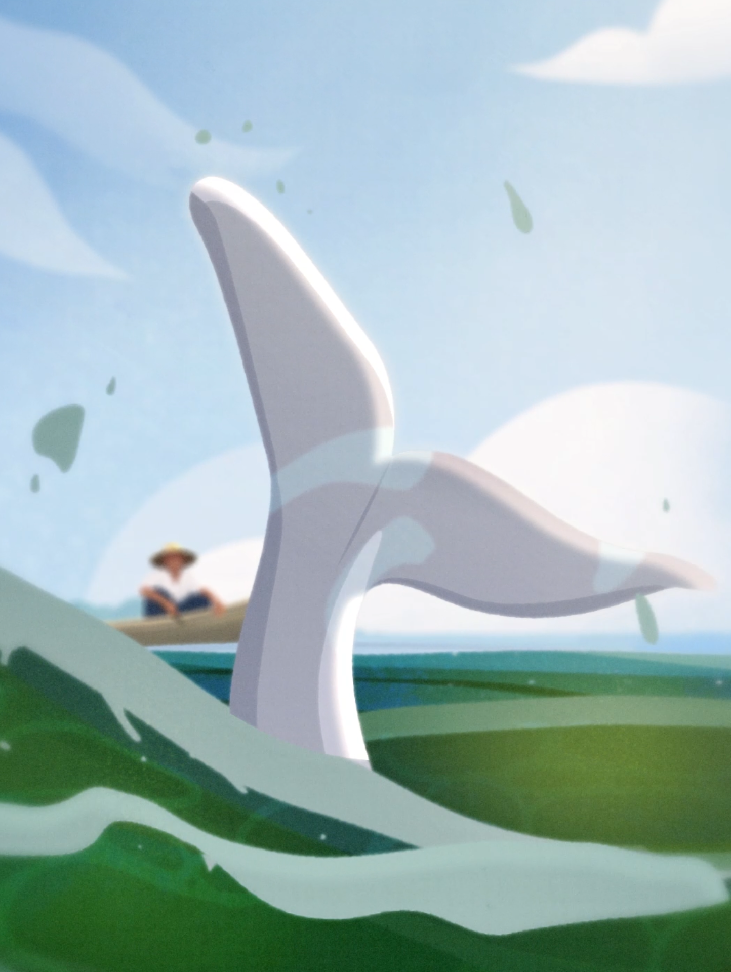
We created a hand-drawn animated film, narrated by Stephen Fry, to support Fauna & Flora’s fundraising appeal to protect Myanmar’s critically endangered Irrawaddy River Dolphins and their unique bond with local fishermen.
A sensitive awareness film sharing real stories of mothers diagnosed with breast cancer during pregnancy—highlighting the emotional impact, encouraging early detection, and showing strength in the face of vulnerability.
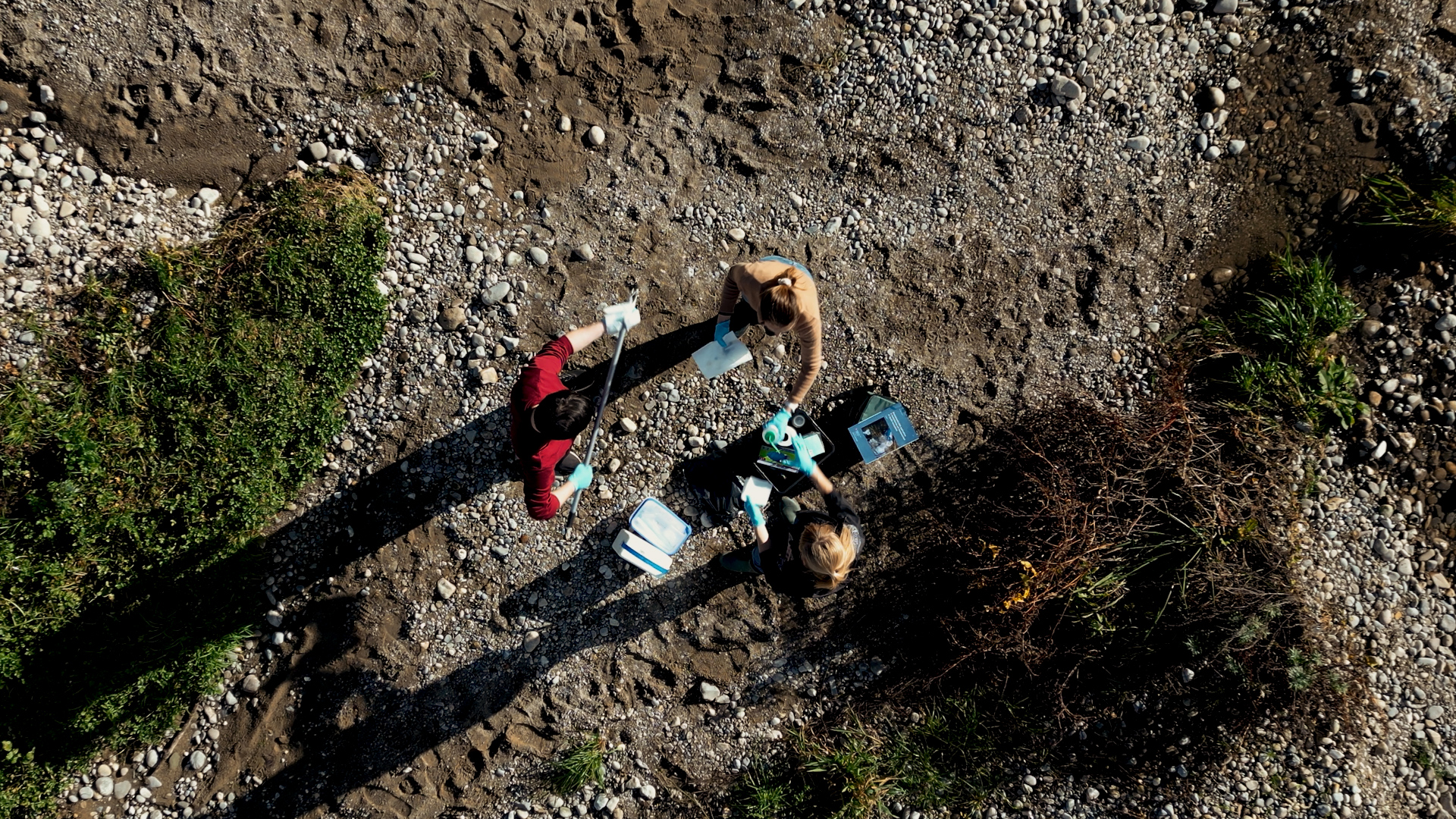
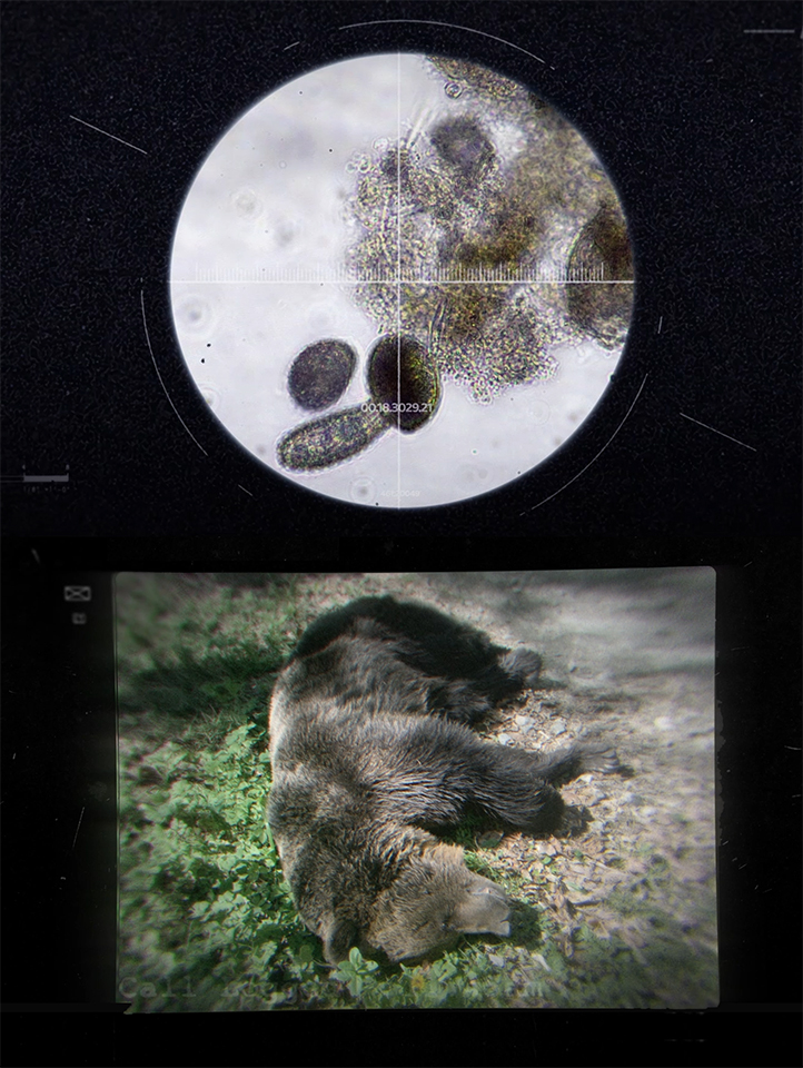
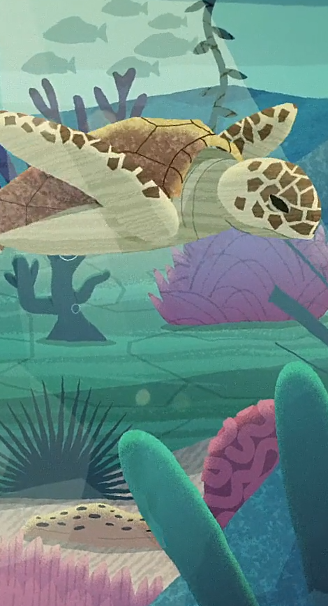
We produced a science documentary in Geneva using eDNA and NGS to showcase biodiversity research. Filming combined interviews, experiments, drones, and cine cameras, followed by full editing, grading, and review.
We created a clear, visually engaging animation for Illumina that explains the complex RNA sequencing workflow, using modern design, accessible language and custom visuals to support scientific understanding.
We created a mixed-media video for TB Raab to highlight illegal wildlife poisoning and its devastating ecological impact.
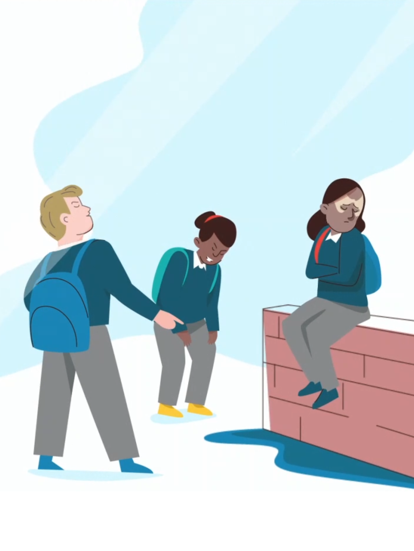
We created an accessible animation for Scope, using real stories from disabled jobseekers, bold visuals, subtitles and clear design to highlight employment challenges and ensure inclusivity for a diverse audience.
We created a visual identity for St Andrew’s Healthcare inspired by Kintsugi, using it as a powerful metaphor to express hope, healing and transformation for people living with complex mental health needs.
The Deben Sounding Project supports inclusive, community-led decision-making for sustainable land use and estuary management in Suffolk’s Deben Estuary, addressing environmental change and landscape resilience through collaboration.
Emotive animation exposing the damage caused by bottom trawling in marine protected areas.
We created a detailed animated film for Syngenta, telling a multi-generational farming story that highlights the evolution of agricultural innovation, digital technology and sustainability through a human lens.
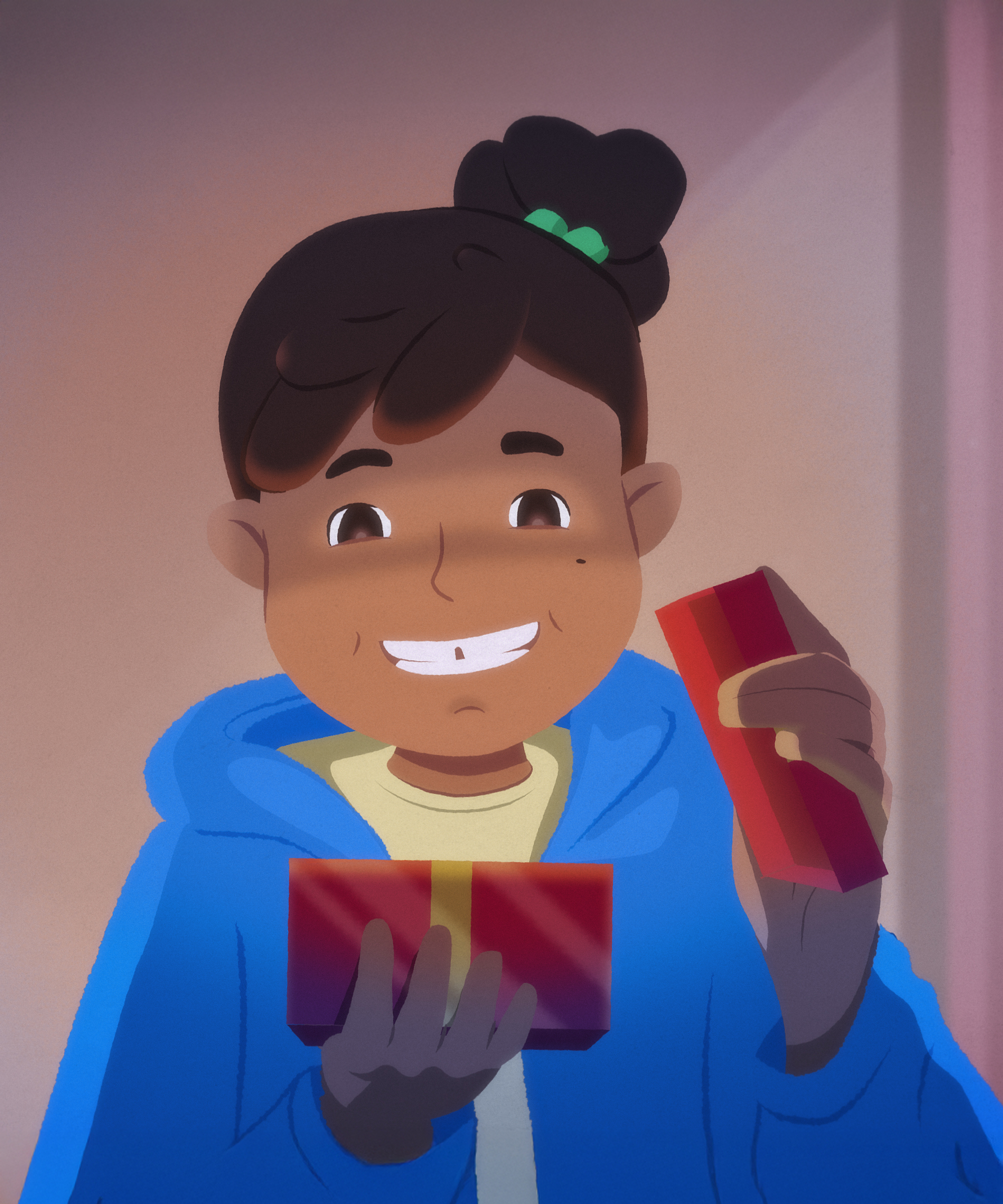
We created a heartwarming animated Christmas advert for Alpha, combining 2D animation, custom music and emotional storytelling to build brand awareness across TV and digital during the festive season.
Illumina came to us to help promote the benefits of their whole-genome sequencing; a test that allows NICU staff to diagnose critically ill infants with underlying genetic causes.
We worked closely with Economist Impact to support them on a variety of animation, mixed media, and film projects.
We created a charming, character-led animation series for UCL to promote the value of longitudinal studies, sparking interest and guiding researchers to explore deeper through the CLOSER website.
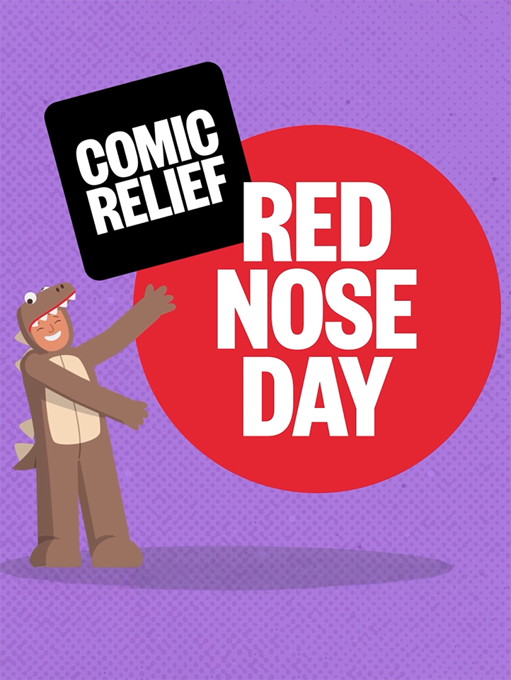
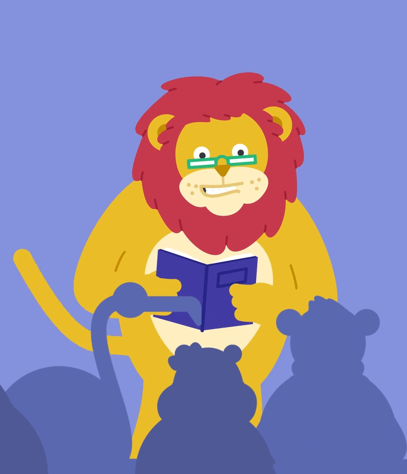
We created a fun, character-led animation for Comic Relief to inspire young people to fundraise and support charitable causes.
Childnet UK filmed authentic youth voices on screen time and internet safety, offering real advice for parents. A relaxed setting ensured natural responses, prioritizing honesty over perfection in production.
We created an animation for ODI at COP29 highlighting the global need for adaptation finance in developing countries.
We created a heart-warming animated advert for Alpha, combining 2D animation, custom music and emotional storytelling to build brand awareness across TV and digital.
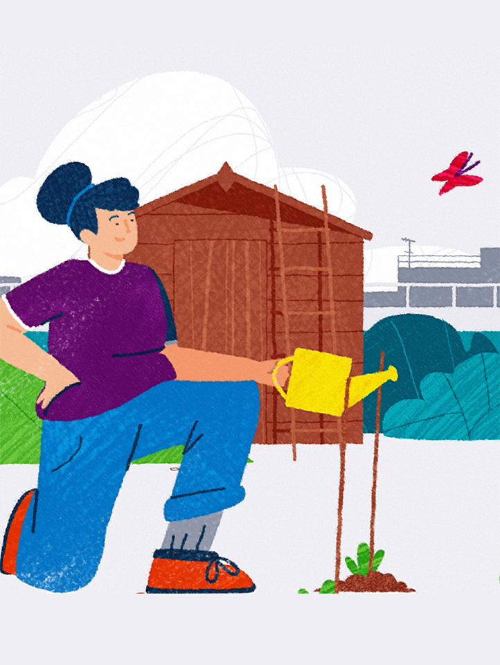
We created an animation with Cumbria Woodlands and The Woodland Trust to promote ancient woodland restoration, helping protect rare habitats, reverse decline and support resilient, self-sustaining woodland ecosystems across the UK.
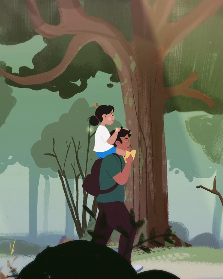
We created a picture book-style animation for Indeed’s Tick Tock Till Bedtime campaign, sparking parent-child conversations about work-life balance through storytelling.
We created a calm, informative animation for Invitae to support patients undergoing genetic testing, using soft colours, gentle motion and DNA-inspired visuals to explain complex information with sensitivity and clarity.
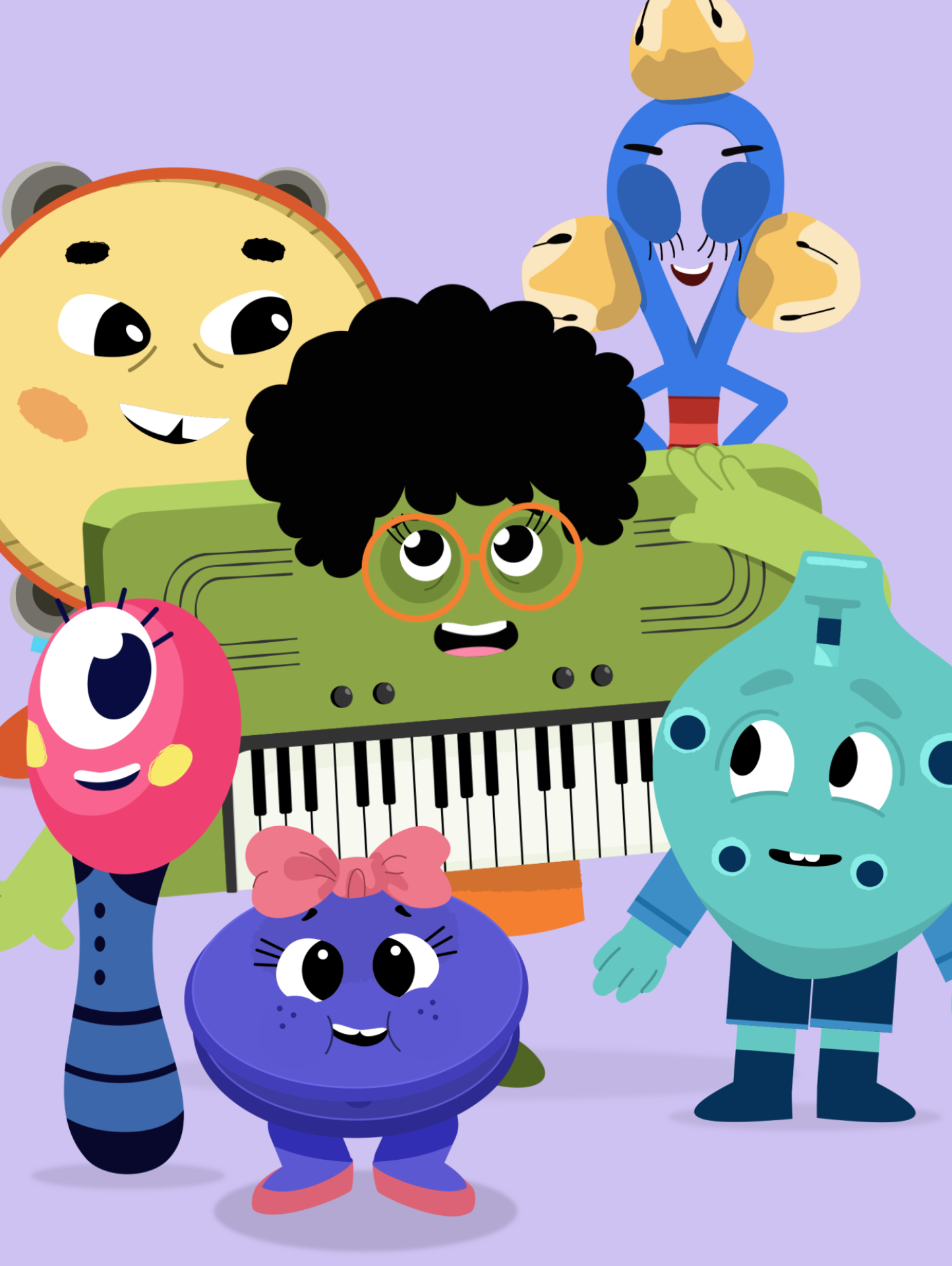
We created vibrant, character-led animations for Roehampton University to help autistic children learn musical instruments, combining engaging visuals, accurate demonstrations, and original music from the Royal College of Music.
We created a powerful animation series with IIED, amplifying the voices of young climate activists from least developed countries through authentic storytelling, original music, and a unique live-action to animation reveal.
We created a sensitive, character-led animation for Barnardo’s to explain Baby and Me, a vital safeguarding service supporting families during pregnancy when a baby is at risk of removal at birth.
We created a heartfelt animation for Barnardo’s, using Rachel’s real story to help potential foster families understand the emotional experiences of children in the foster care system.
We created a character-led animation for DRAGEN to explain its role in genomic data analysis, combining 2D and 3D visuals for accuracy, clarity and localisation across multiple languages.
We created a bright, inclusive animation for Autistica to help audiences understand what anxiety feels like for autistic people, using clear visuals to express emotion without causing overwhelm or distress.
Animated film for DLA Piper showcasing how SuccessFactors transforms performance reviews into continuous, empowering development through feedback and goal-setting.
We created a child-led animation for Anna Freud to support mental health during the transition to secondary school, using real stories, peer voices, and relatable characters to promote open discussion and understanding.
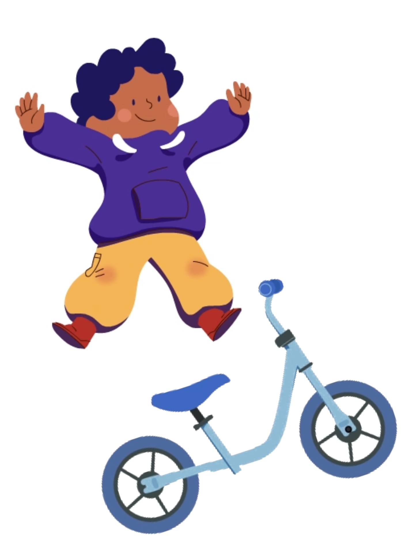
We created a fun, character-led explainer animation for Bike Club, highlighting how their kids’ bike subscription works, the ease of swapping bikes as children grow, and the environmental benefits of membership.
We created engaging, on-brand videos for Railpen to highlight key report themes, boost engagement, and support targeted internal communications.
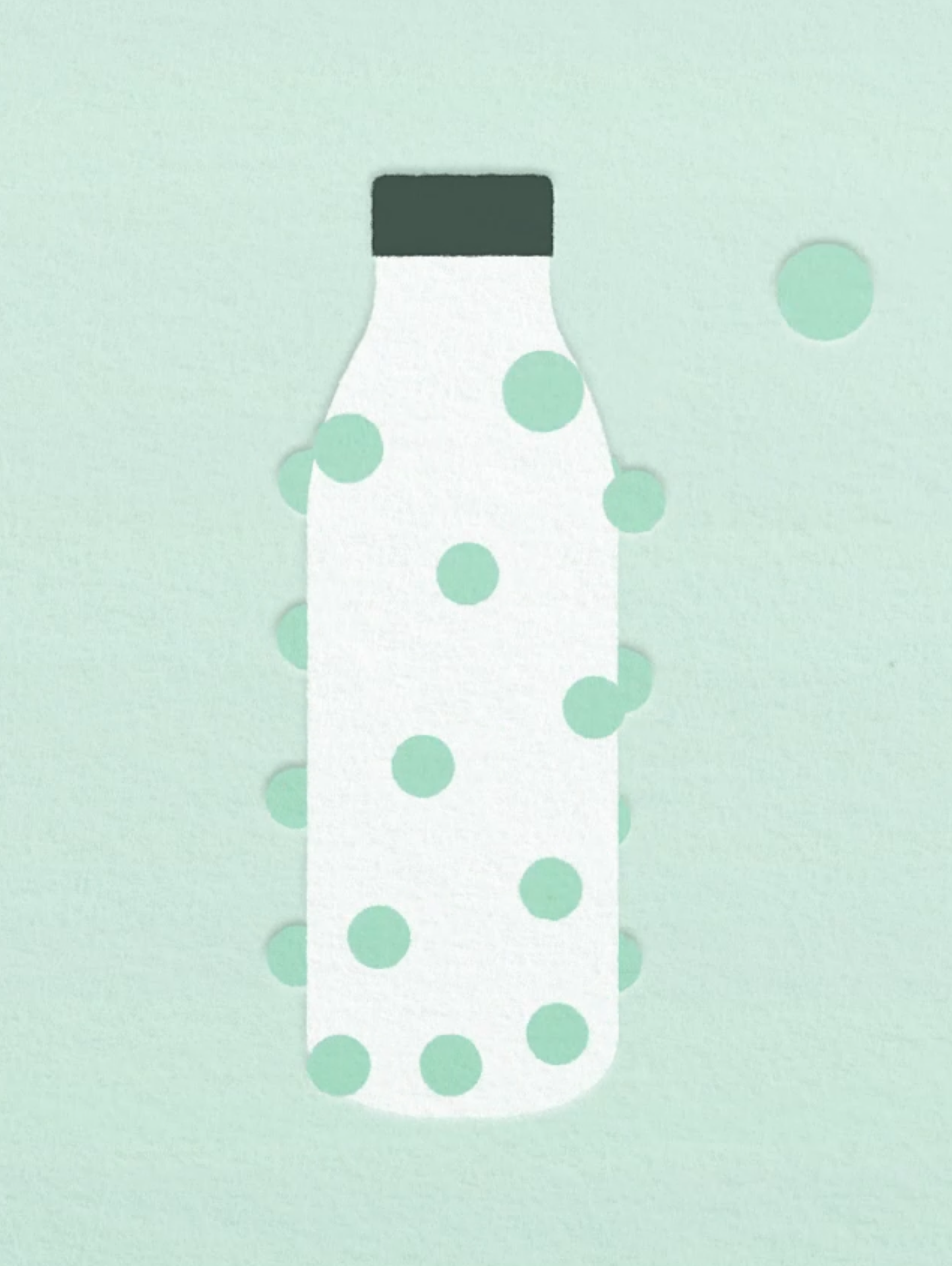
We created an animation with Pulpex exploring the lifecycle of a paper bottle.
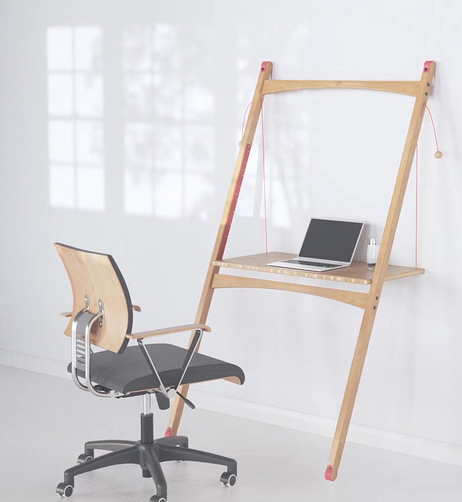
We created a clean, minimalist animation for Lean Desk that highlights its versatile uses and provides simple, visual assembly instructions, showcasing the product’s adaptability for work, reading, sketching or presenting.
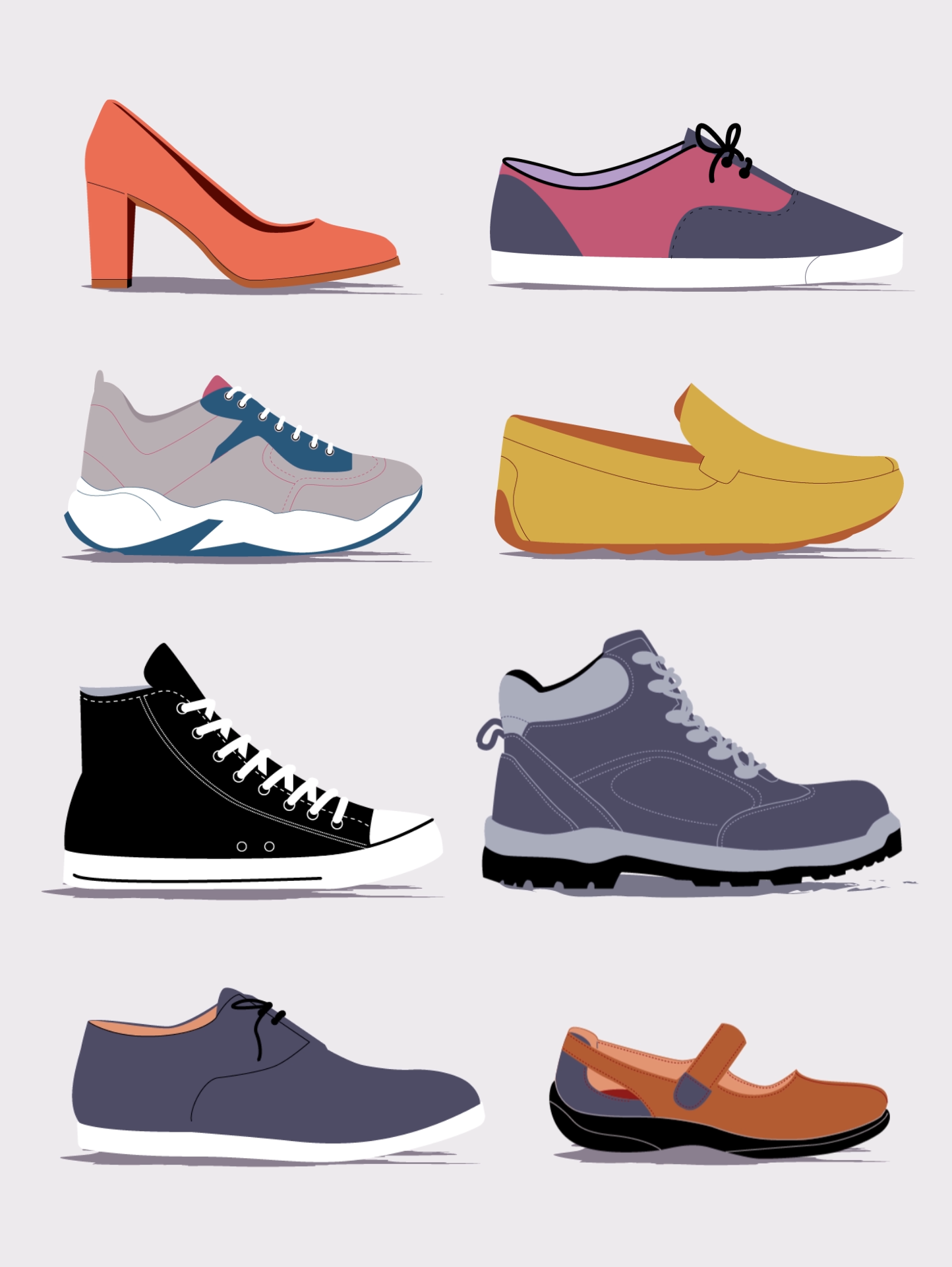
We created nine animated videos for the British Footwear Association, combining stylish character design with technical accuracy to engage fashion-conscious learners and explain complex shoe construction processes.
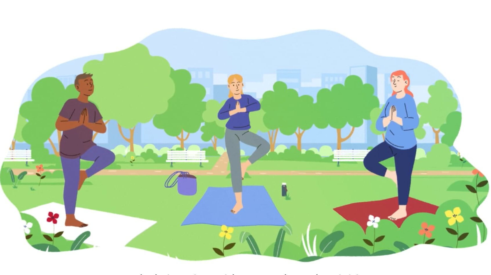
We created a series of engaging animations for Natural England to explain the benefits of Green Community Hubs and Social Prescribing, highlighting nature-based activities, co-creation, and the impact of green spaces on community well-being.
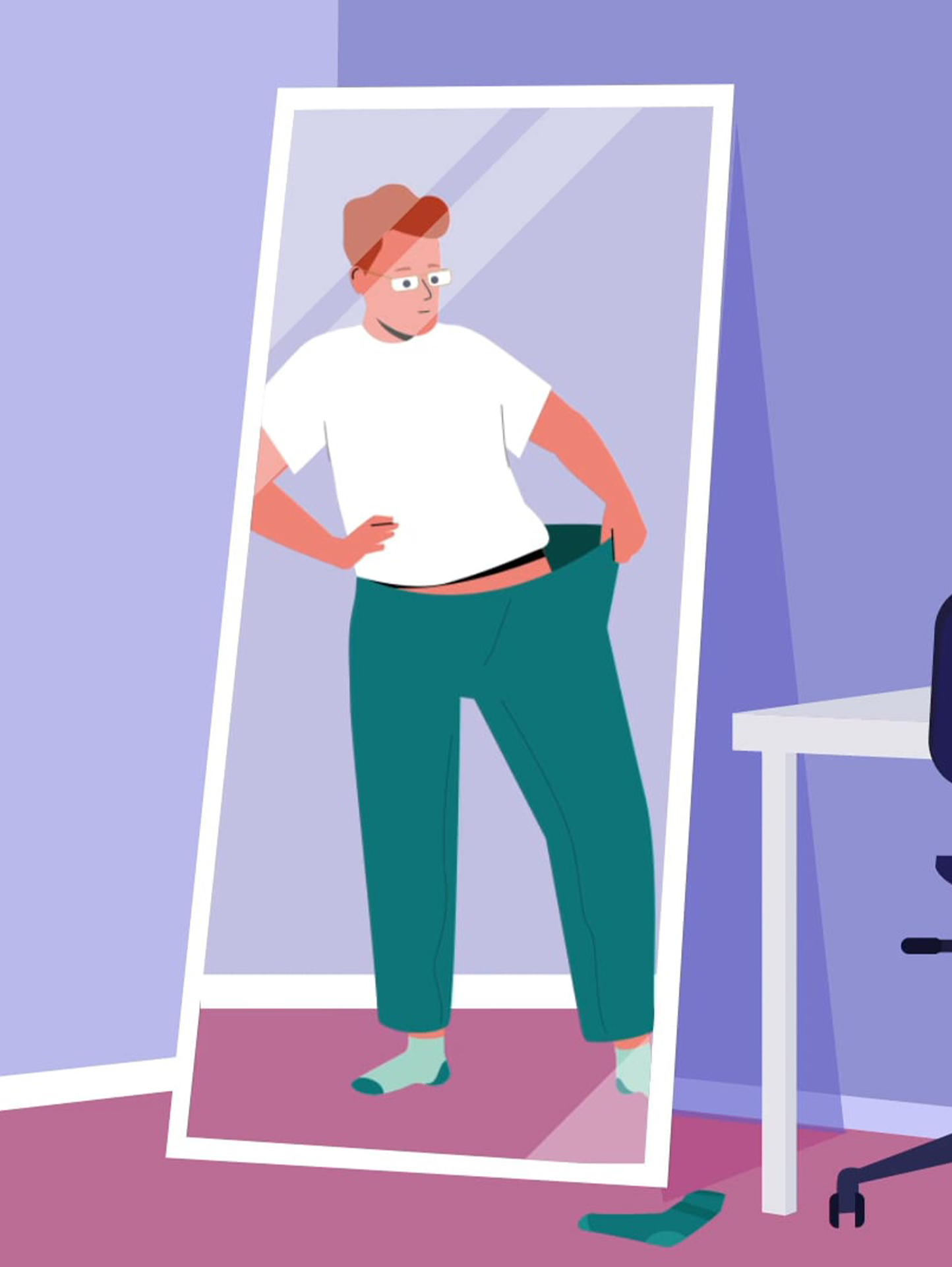
We worked with Solvd and Novo Nordisk to create an animation explaining the science of obesity and the support that is available.
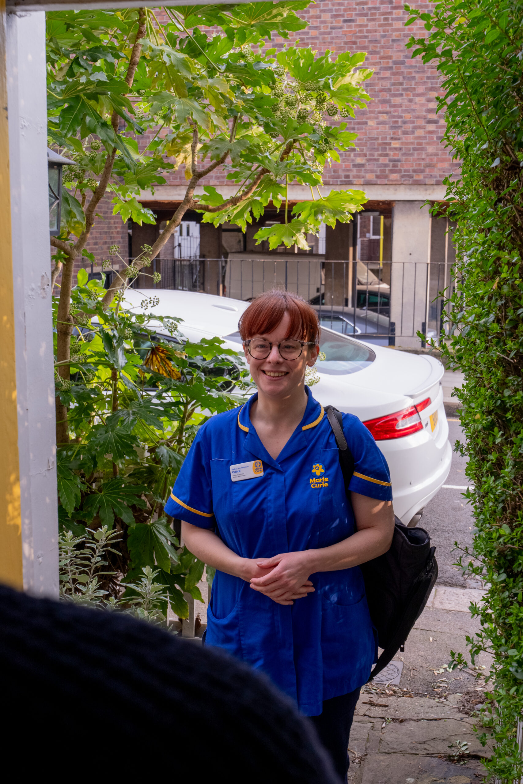
We created a 2D animation for Marie Curie to promote its bereavement support hub, encouraging compassionate workplace conversations and raising awareness about how to support grieving colleagues.
We created a technically-focused animation for MagLense to engage engineers and investors by visually explaining complex wireless power transfer technology for medical and wearable devices.
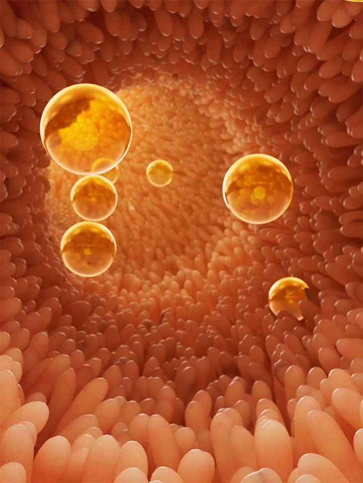
We created a clear, engaging animation for AB Biotek that visualises DAO Deficiency and shows how DAO Microcapsules work in the body, helping audiences understand the enzyme’s benefits and delivery system.
An animation for Hackney Council explaining structural racism and promoting active anti-racism through clear metaphors and inclusive storytelling.
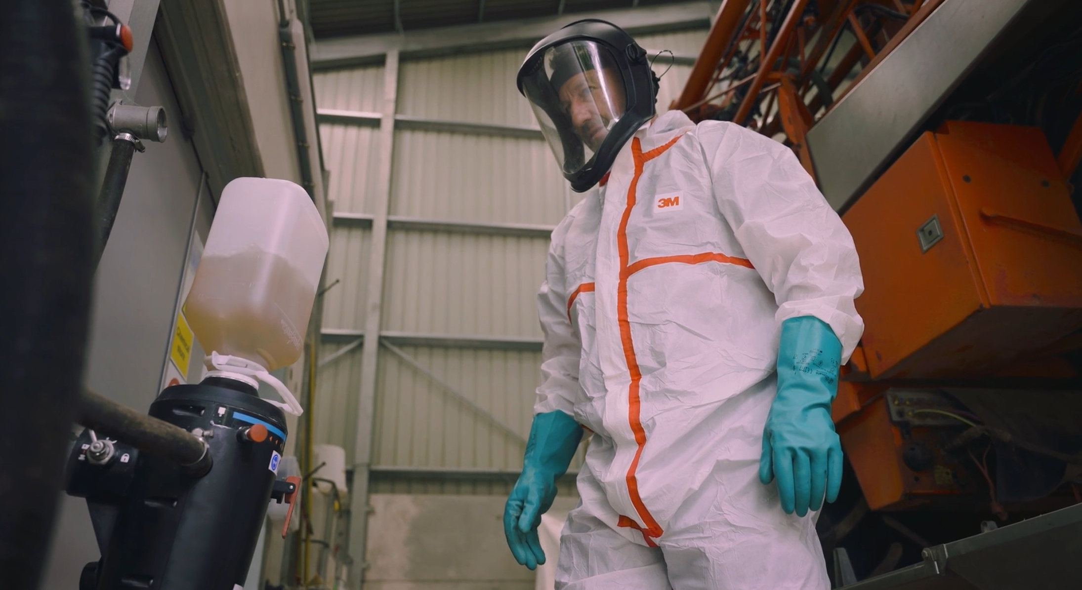
Syngenta’s innovative EVOPAC packaging, co-designed with growers, enhances sustainability, safety, and user experience. The film features interviews, b-roll, and motion graphics to showcase its practical agricultural benefits.
We created a painted-style animation for the Mava Foundation’s closing event, celebrating 30 years of global conservation impact. The film honours their legacy through storytelling, archival imagery and a bespoke soundscape.
We created animated content for CW+ and NHS Trusts to support alcohol harm reduction, raise awareness among patients and staff, and encourage open conversations and support during #Stoptober and beyond.
We created an emotive animated film with MHA to promote music therapy’s powerful impact on dementia care, telling Sally’s story and inspiring donations during BBC Music Day’s Moments of Joy campaign.
We created a series of healthcare explainer animations for Bupa Health’s YouTube channel, using a clear, contemporary visual style to explain medical procedures to existing and potential customers.
We created a vibrant, on-brand explainer animation for Eden Project Communities, blending textured visuals and a hand-drawn aesthetic to introduce their initiative and inspire audiences to explore further.
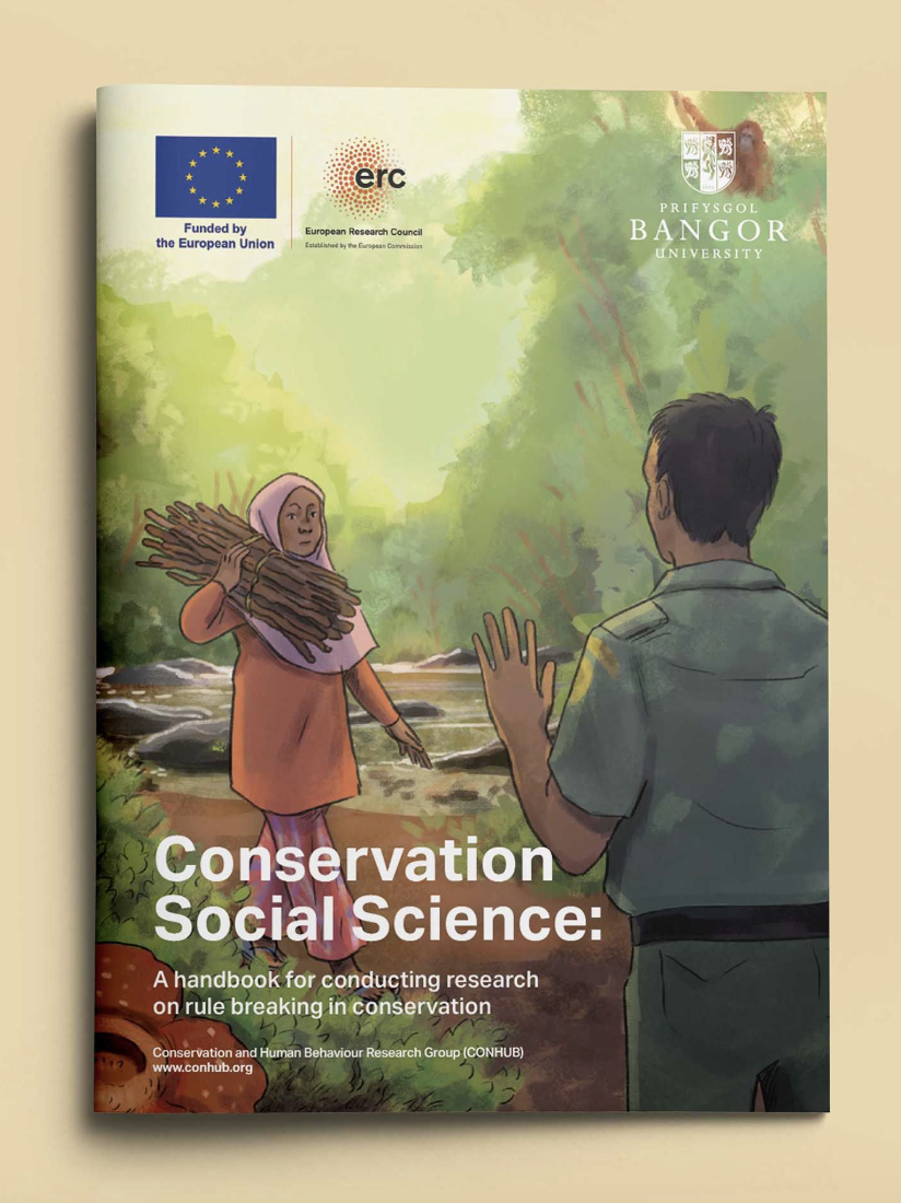
We created visual assets with ConHub to highlight how human behaviour influences conservation success, policy decisions and biodiversity outcomes.
We created a humorous, Fairytale-inspired animation and learning resources to challenge gender stereotypes in career aspirations, through an engaging, research-backed educational campaign.
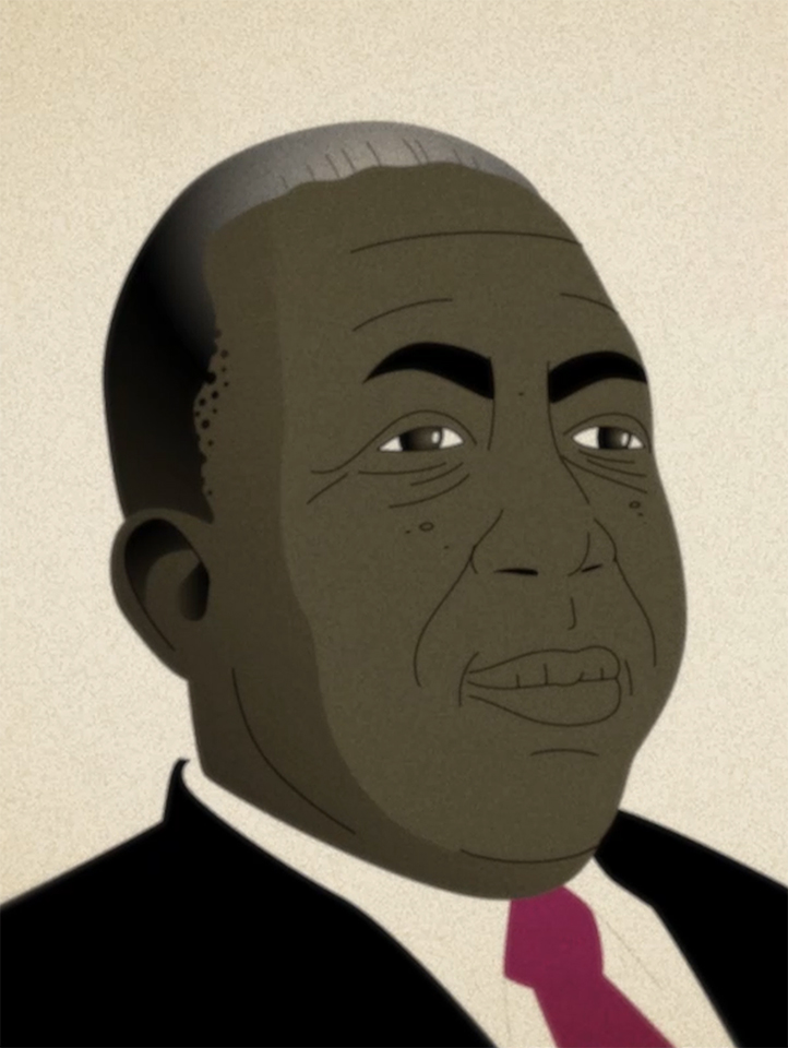
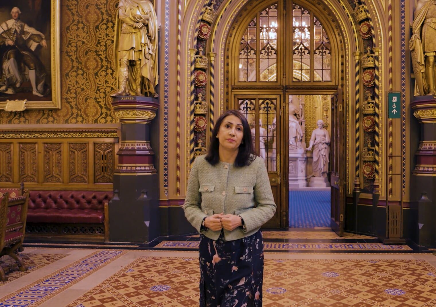
We created a multi-channel campaign for The House of Lords celebrating Sir Learie Constantine’s legacy and promoting diversity in Parliament.
Deloitte commissioned The Like Minded to create an accessible, emotionally-driven animation for Power2, highlighting its impact on teens through engaging visuals, dynamic colour, and tailored sound design.
We created engaging 3D-animated educational content on Marie Curie for KalamTech’s app, narrated by Miriam Margoyles, designed to boost empathy, learning, and recall for primary school children.
We worked with Marie Curie to create a clear, compassionate explainer combining film and animation to help patients better understand syringe drivers and reduce fear around their use.
We partner with The Inns of Court College of Advocacy (ICCA) to create promotional and informative film content, highlighting the ICCA Bar Course through student testimonials, interviews, and event coverage.
We captured video and photography at a Railpen event, documenting talks and key moments. The content helps raise awareness and generate publicity to support future event promotion and engagement.
We helped St. James’s Place communicate their investment beliefs and ESG commitment through a live-action interview supported by motion graphics, making key messages about sustainable returns clear and engaging.
We created a film with SGS to showcase how NextSeq 2000 supports biodiversity research—translating complex science into a clear, engaging story about innovation, discovery, and environmental impact.
Animated film promoting social prescribing, using vibrant visuals to highlight community activities that improve mental and physical health outcomes.
We created a powerful mixed-media campaign for TPCA, using animation and photography to highlight poor living conditions in new homes and advocate for healthier, more human-centred building regulations.
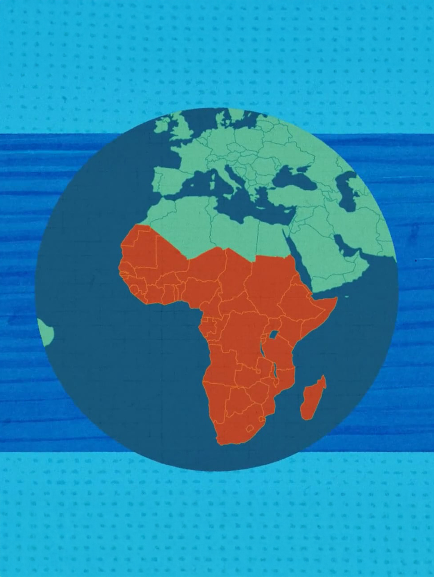
IEEFA asked us to create an animation highlighting the risk of stranded gas assets. We combined live-action and animation to explain energy trends, amplify their findings and connect with investors.
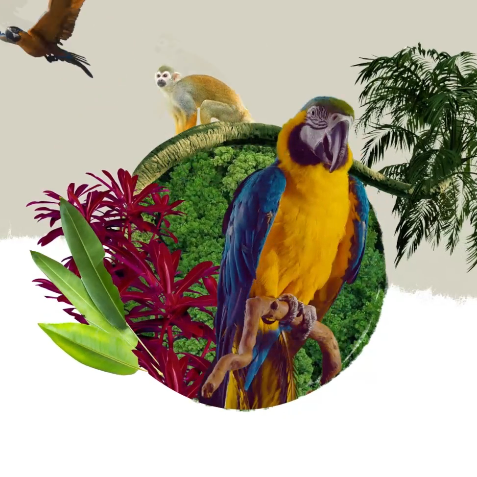
Fauna & Flora International asked us to create an engaging explainer video to clarify biodiversity and its loss. We delivered a fun, collage-style animation that encourages awareness and open conversation.
We created an engaging animation and school-ready learning resources using animal characters to help 7–11-year-olds explore gender stereotypes in career aspirations, based on research from the Millennium Cohort Study.
We created an organic, hand-drawn style animation for Syngenta to explain RNAi biocontrols, highlighting their precision, environmental benefits, and ability to protect ecosystems while targeting harmful pests.
We created a vibrant, handcrafted explainer animation for Eden Project Communities, using textured visuals and brand colours to reflect their hand-drawn aesthetic and effectively engage audiences with their initiative.
Appeal animation to raise funds and awareness about parasitic worms that infest waters in Malawi, Africa.
We produced a dynamic film for WeWork showcasing daily life and community culture within their workspaces, using a mix of live-action footage and motion graphics to highlight energy and personality.
We created a vibrant, expressive animation for the University of Leicester’s Landscape Decisions programme, explaining how robust research supports better land use, environmental policies, and informed decision-making across the UK.
We created a 2D animation for PACE to help challenge the stigma of child exploitation, using real parent voices and visual metaphors to show the emotional journey from trauma to hope.
We created an animation for Changing Faces to help teachers understand unconscious bias in the classroom and its impact on children with visible differences, promoting more inclusive, supportive school environments.
We created an immersive, insight-driven animation for Autistica’s World Autism Awareness Week campaign, shaped by real experiences and guided by autistic contributors, to reflect both challenges and strengths within the autistic community.
We created a visually rich brand story animation for a UK travel group, blending 2D and 3D techniques to evoke familiarity, highlight growth, and celebrate enduring values through landscape-driven storytelling.
We created a 2D explainer animation for Essex University to help audiences understand household panel studies and their value, using simple characters and visuals for clarity across web and social media.
We created a voiceover-free animation for BirdLife’s World Migratory Bird Day, using visual storytelling to highlight the shared journey of birds and humans and build empathy through active interpretation.
We created a bold, engaging animation for Speedo to promote their mangrove tree-planting campaign, using vibrant colours and graphic text to capture attention and highlight their commitment to sustainability.
We created a character-led animation for the Usher Institute to explain Spectrum’s public health research and raise awareness of how tobacco, alcohol and unhealthy foods contribute to disease and inequality.
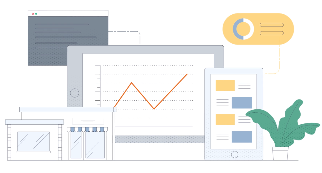
We created a 2D/3D animation campaign for the Smith Institute to simplify Mathematical Optimisation for business leaders, combining real-world visuals, data storytelling, and brand-aligned assets across social and internal channels.
We created an editorial-style animation for LEX to explain their energy trading platform, using a focused colour palette and simple illustrations to highlight key features and position LEX as innovative and trustworthy.
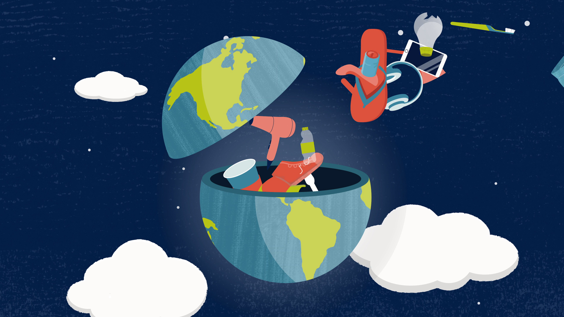
We created a conference animation for Green Alliance, highlighting the need for a circular economy by showing the impact of resource overuse and advocating for halving waste by 2050 to meet targets.
We created a series of five animated videos for Illumina to explain non-invasive prenatal testing, combining emotional storytelling with scientific clarity and designing for a diverse, global audience in 10 languages.
We created a hybrid animation for St. James’s Place, combining rotoscoped interview footage with infographic visuals to explain their investment management approach, fund selection process, and commitment to client-focused financial expertise.
We created a series of five brand-led animations for Freeformers to explain their value proposition, using simple character design, clear storytelling and additional assets like GIFs and subtitled versions for wider engagement.
We created an informative animation for UKLLC to explain how linked health data is securely used in research, answering common questions and highlighting the collaboration’s public health benefits and transparency.
We created a clear, inclusive 2D animation for SWGfL to explain harmful sexual behaviour in schools and promote their support service, helping professionals and young people recognise and respond to HSB.
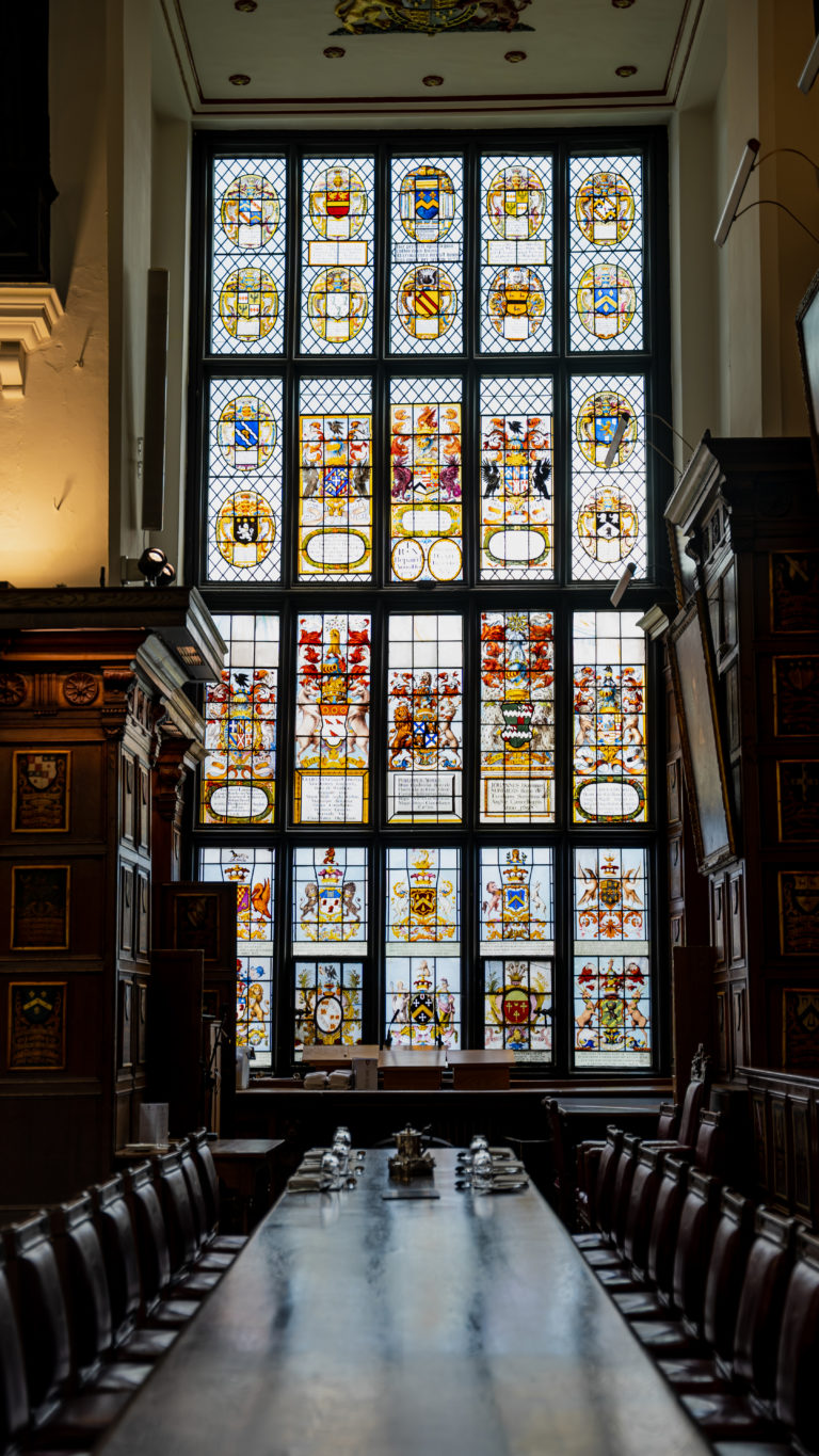
We created a four-minute illustrated film for St Marylebone, blending history, architecture and storytelling to explore 900 years of local heritage and social mission—featuring figures like Dickens and Nightingale.
We created a flexible, voiceover-free animation for Xylem that clearly explains their water technology solutions, designed for use across web, social and presentations, with the option to break into modular content.
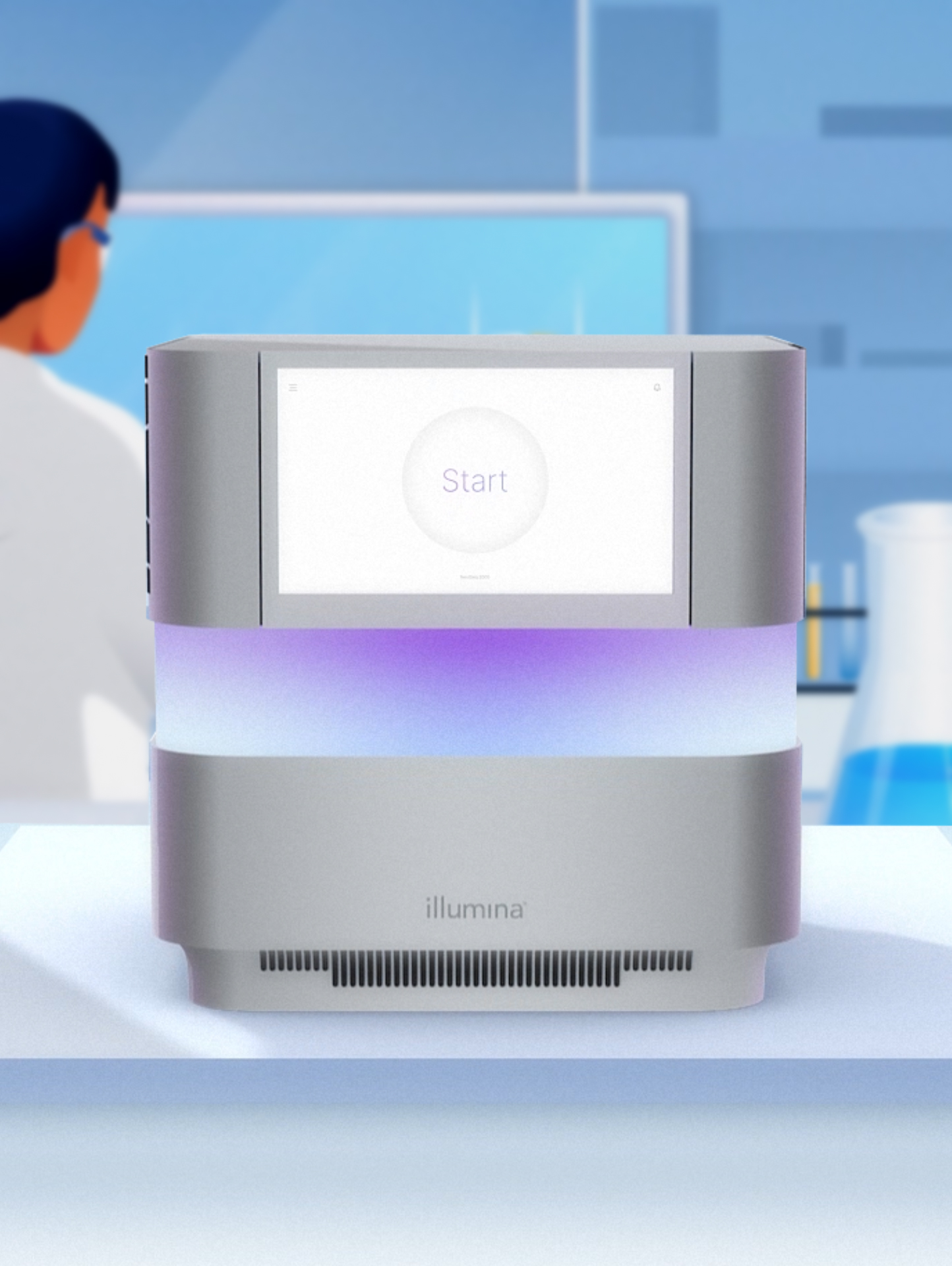
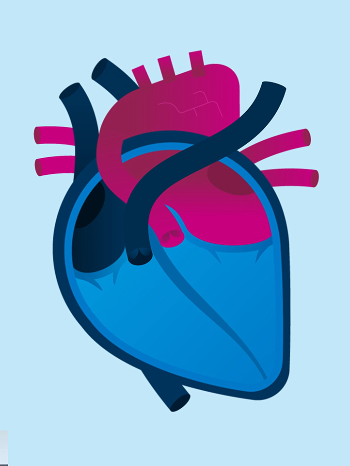
We created a futuristic animation series for Illumina to explain next-generation sequencing, using minimal design, movement, and bespoke sound to simplify complex science and engage global life sciences audiences.
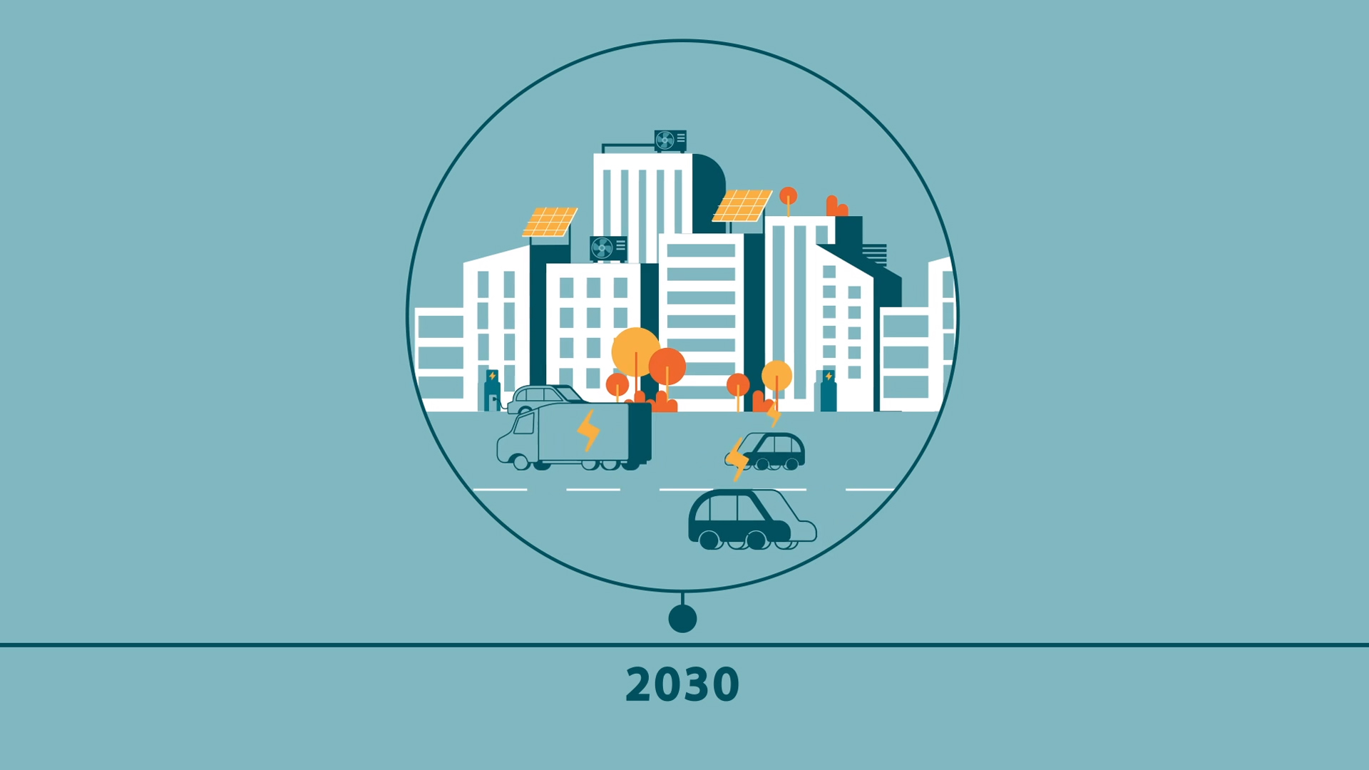
We created a character-led animation for UCL to launch their new MSc in Smart Energy, highlighting course content and inspiring students to lead the transition to a sustainable global energy future.
A clear, engaging film that reveals how the House of Lords improves UK legislation and holds the government to account.
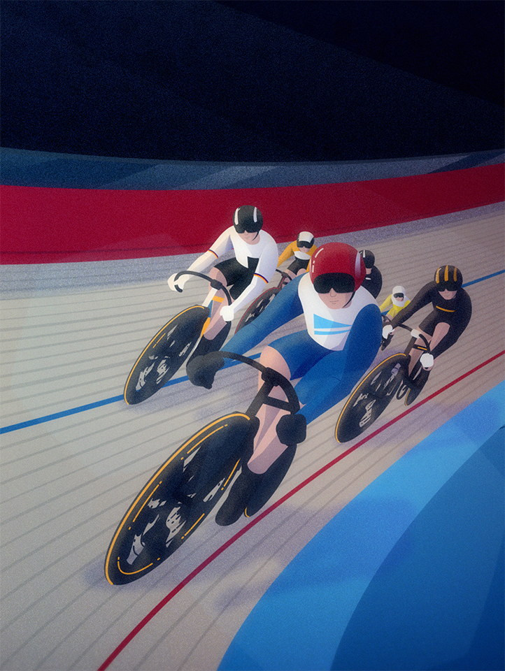
We created a dynamic centenary animation for Evans Cycles, blending 2D, 3D and frame-by-frame techniques to celebrate 100 years of UK cycling history with era-specific detail and seamless transitions.